Requirements
Requirements of Leo Elements
First of all, we'd like to say thank you for choosing our work.
Leotheme - a website where you can find the best Prestashop theme and their Extensions . We're proud of our professional themes, extensions. With years of experience working on Opensource, we have created a great number of extensions for Prestashop like: Leo Prestashop Framework, Leo Megamenu Prestashop Module ...
Leotheme is also famous for custom work, if you have any trouble or need help with your website design, coding part, .... we will always be here to support you or to give you the most brilliant solution.
Our main goal with Leo Elements is to create the fastest, most advanced page builder for PrestaShop. For this, we make sure that it is based on the latest technology that available. (If you aren't sure if your server supports this or not, contact your host for more information). Here are some basics of installing, configuring and customizing the Leo Elements.
- PrestaShop 8.0 or Greater
- Compatible with PHP 8
- Database
- Memory Limit: The more the better… (128 MB or higher is preferred)
- Browsers: Leo Elements is supported on almost all browsers
- Device: It is not possible to edit with mobile phones and tablets for the moment. It is possible to work only with desktop computers.
LeothemeTeam
Download and Install
What is Leo Elements
Leo Elements is the powerful module followed Prestashop Standards which contained Necessary Features to build professional Prestashop site within minutes. Leo Elements has Four components, they are AP Profiles Manager, AP Position Manager, AP Product List Builder and AP Widget Manager. It shows the rationality in the administration and the apparently purpose of each module.
Here are some basics of installing, configuring and customizing the Leo Elements.
Download
Leo Elements has been realeased, after purchasing this module you can download it at our official site or at other market as Prestashop Addon, Themeforest. Another way to experience the powerful Leo Elements Module is to purchase our prestashop theme, Leo Elements is intergrated in every theme.
Install
You can install our modules in an easy and fast way. When you're doing the installing and setting process, we will always be there to support you if any problem occur.
Install the module from Back Office
- In the Modules tab, click on Upload a module
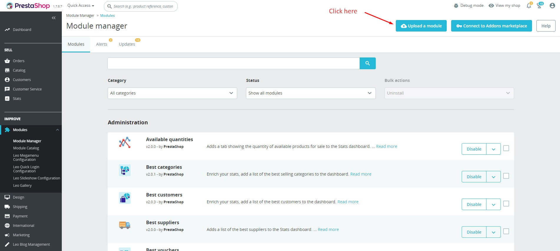
- Browse to open the dialogue box letting you search your computer and select the file or just drop your module to the upload area.

- If the installation is successful, the following message will appear:

- The module is successfully installed, now click on the Configure button to setup the module.
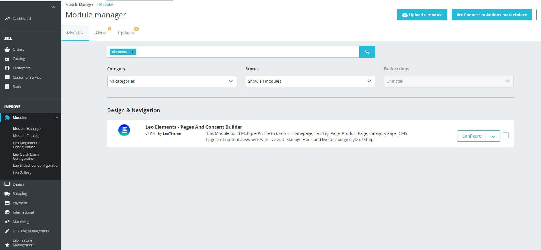
- Or you can access the module manager tab, then search for Leo Elements, enable it then open its setting panel.
Changelog
v1.0.0
First Release
How to use
Leo Elements is a visual page builder module for PrestaShop that enable you to create a web pages in live.
If you are new to prestashop. Please read prestashop guide first:
http://doc.prestashop.com/display/PS16/Getting+Started
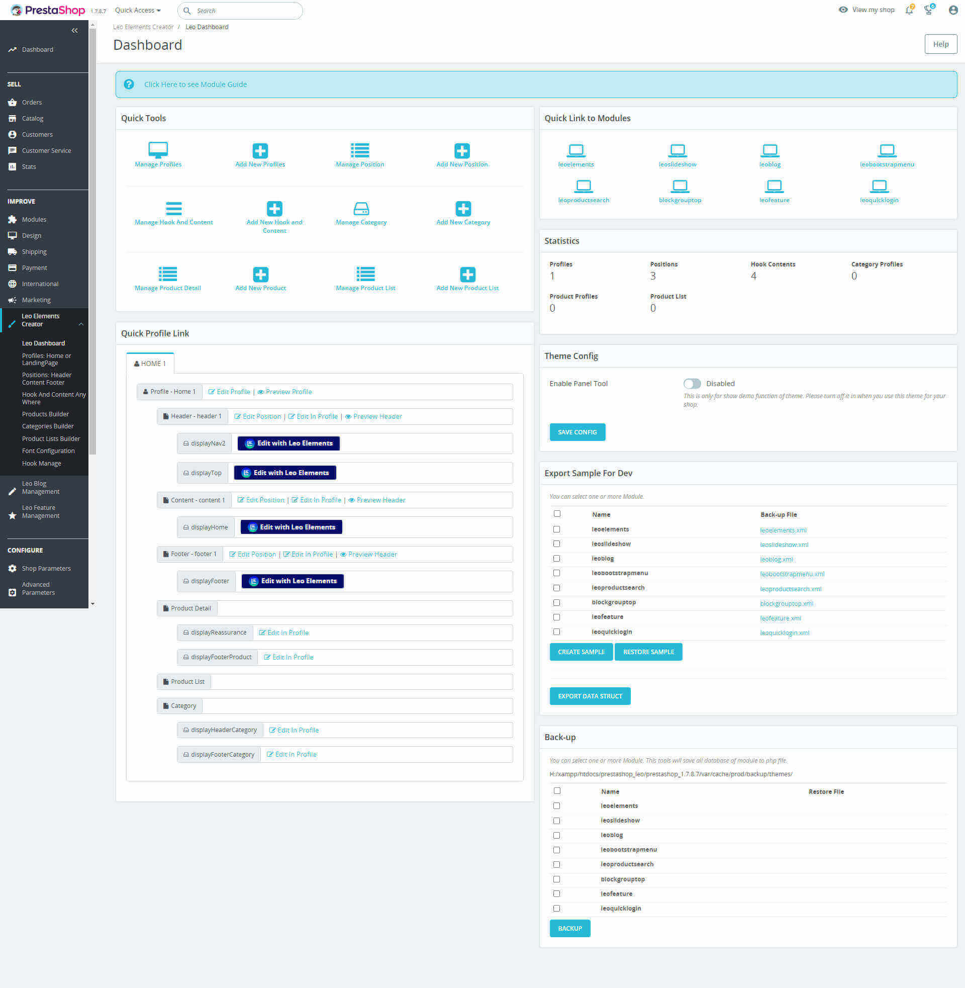
Leo Dashboard

1: Configure links to sections of module Leo Elements
2: Configure links to other modules.
3: Statistics of profiles, positions, hooks, etc. was created with Leo Elements
4: Links to each position of the Profile.
5: Hide or Show Panel tool.
6: Export Sample For Dev
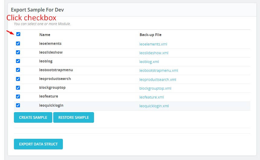
+ To export data of module Leo Elements, you should check the modules you want to export.
+ The next step is to click the "Create Sample" button.
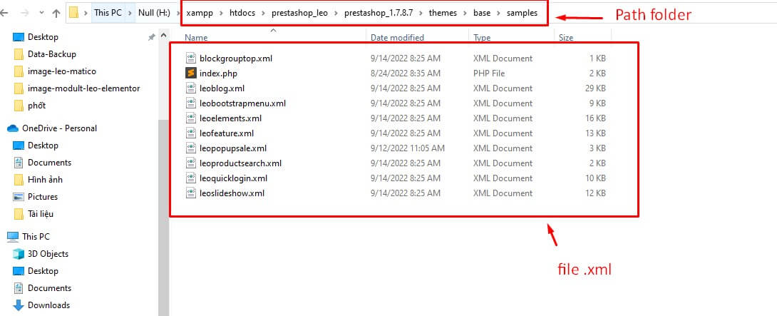
+ The system will automatically export file .xml" in folder at "Sample" located in theme: Example: H:\xampp\htdocs\prestashop_leo\prestashop_1.7.8.7\themes\base\samples
7: Back-up
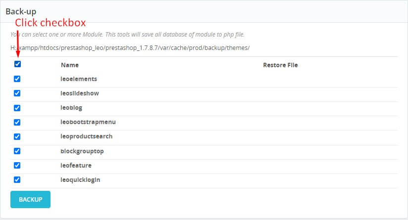
+ To back-up data of module Leo Elements, you should check the modules you want to export.
+ The next step is to click the "Backup" button.
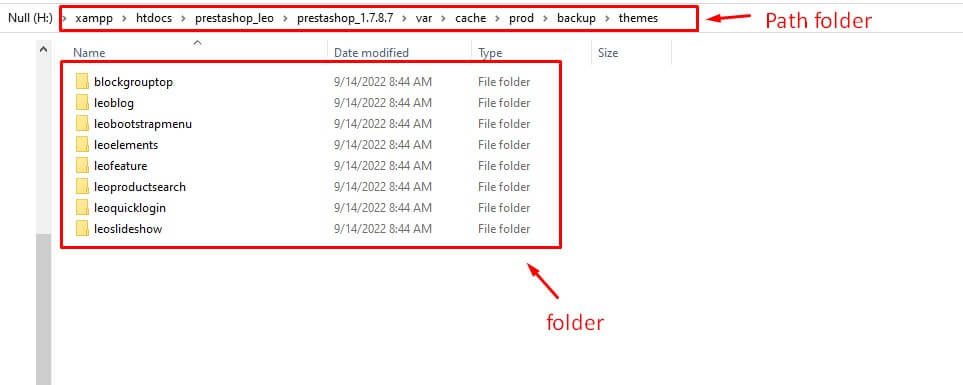
+ This tools will save all database of module to php file in folder. Example: H:/xampp/htdocs/prestashop_leo/prestashop_1.7.8.7/var/cache/prod/backup/themes/
- After creating a profile and position of a page, we have the result of the Leo dashboard tab.
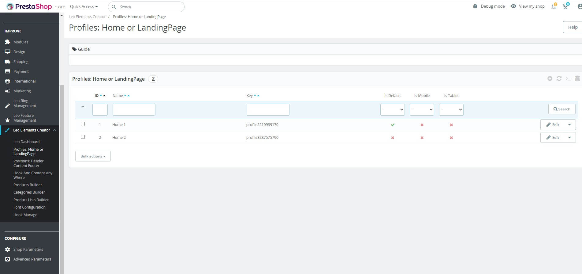
Profiles: Home or LandingPage
- This module supplies many widgets to build features for sales, and intuitive user interfaces flexibility. It also integrates your work in this module, you only need to do it one and then you could reuse it.
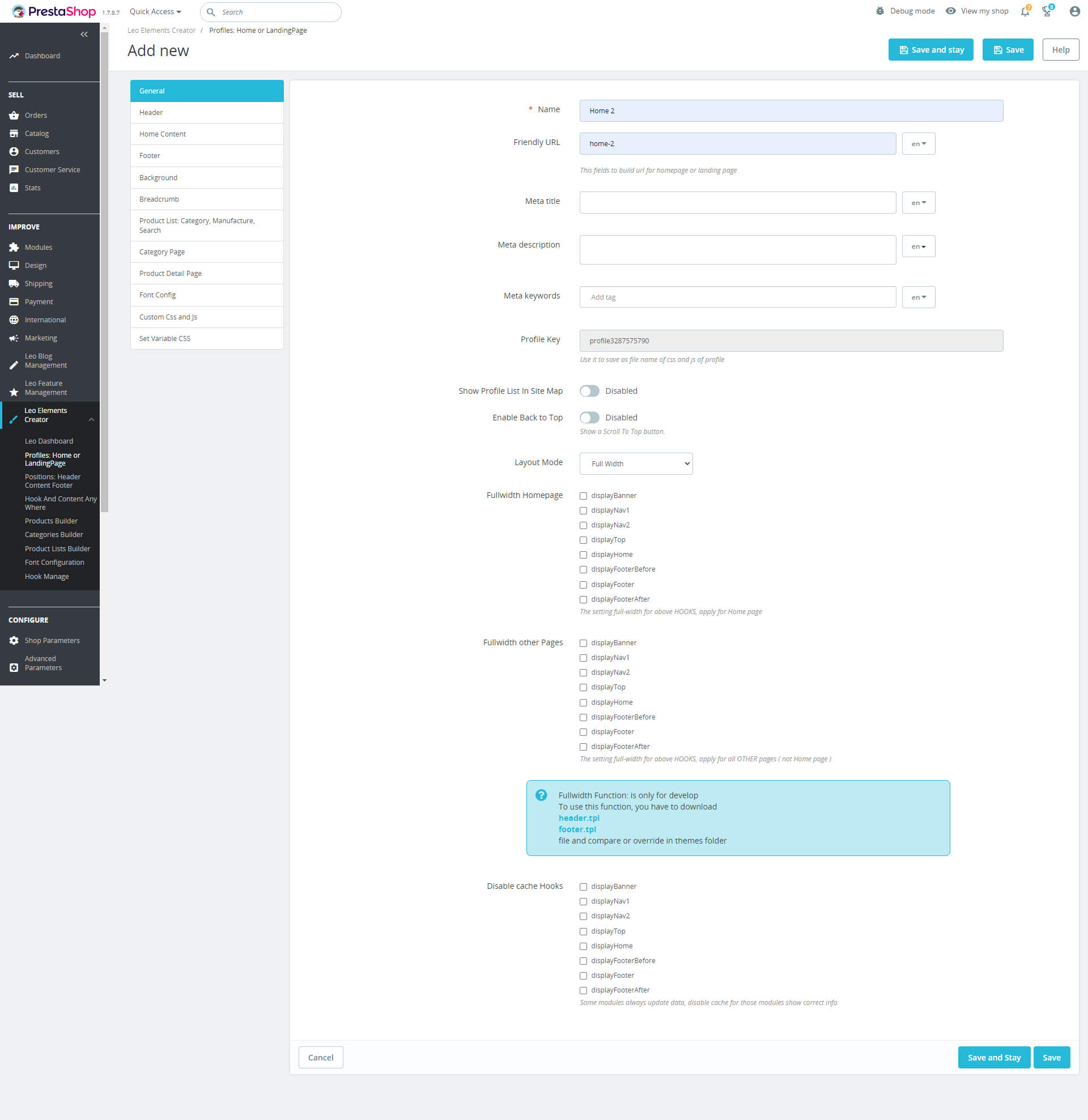
- How to create a new profile screen: From the menu on the left "Profiles: Home or LandingPage" to the next screen lists Profile; Use click "Add new" button to create profile.

- When you access "Add New" page, you need to fill in all these blanks below:
- General
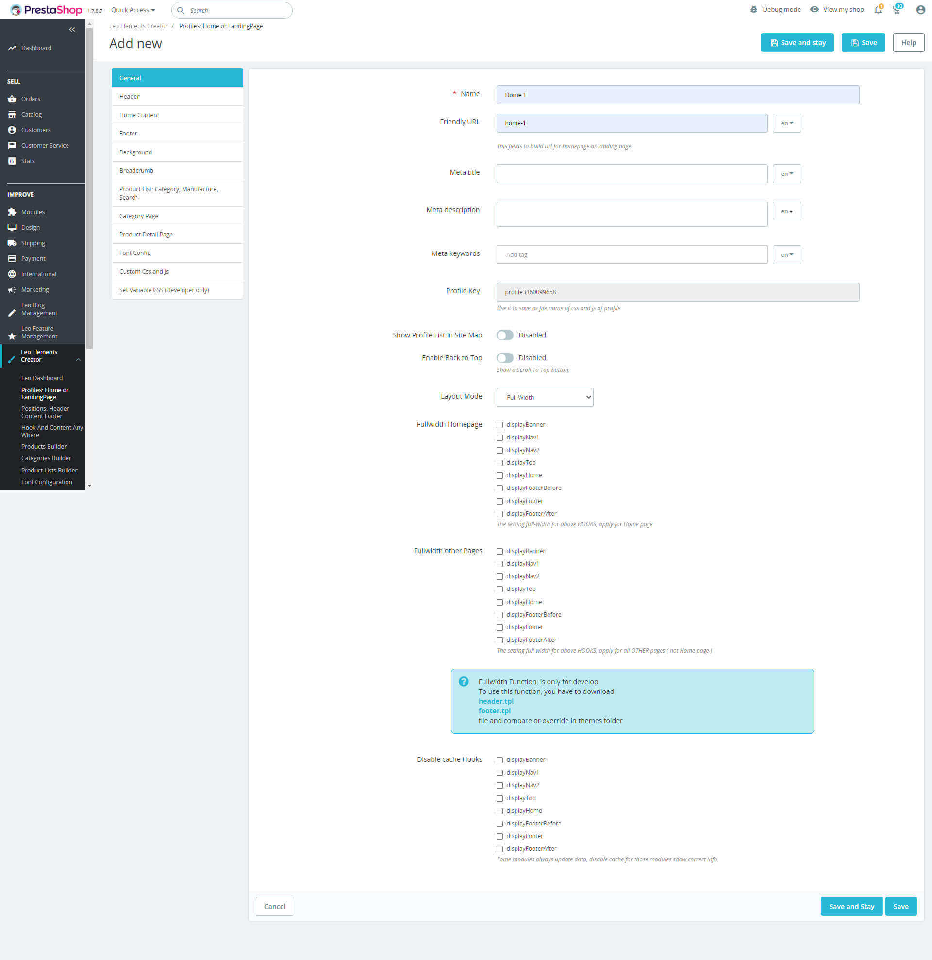
- Name: Name of profile.
- Friendly URL: This fields to build url for homepage or landing page
- Meta title: These fields are used to create a title for the homepage or landing page according to SEO standards.
- Meta description: These fields are used to create a description of the title for the homepage or landing page.
- Meta keywords: These fields are used to create keywords for the title of the homepage or landing page.
- Profile Key: The Character string of profile.
- Enable Back to Top: Show a Scroll To Top button.
- Layout Mode: Set the layout for the pages, there are 2 modes: full width and boxed large.
- Fullwidth Homepage: The setting full-width for above HOOKS, apply for Home page
- Fullwidth other Pages: The setting full-width for above HOOKS, apply for all OTHER pages ( not Home page )
- Disable cache Hooks: Some modules always update data, disable cache for those modules show correct info.
- Click "Save" button when you finish the process.
- Header
Header is the top part of the web page. It is the introduction part of the website where people have their first impression before diving deeper. Header is considered as an "invitation" with the task of providing core information about the product so that customer can grasp the information in just a few seconds.
Headers can include multiple layout elements, for example:
+ Basic elements of brand identity: logo, brand name, slogan, mascot, etc.
+ Links to basic website content categories.
+ Links to important social networks
+ Basic contact information (phone number, e-mail, etc.)
+ Switch language, Search field, login, register, etc.
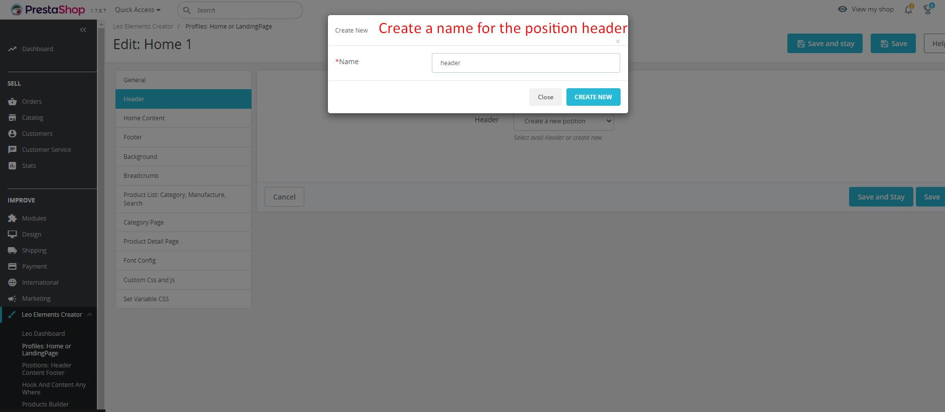
- Access the Header tab, then choose to Create a new position.
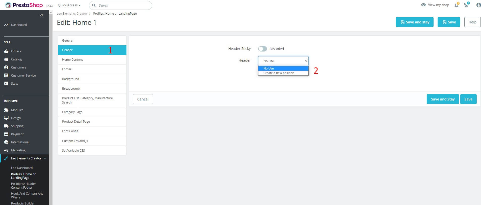
- Create a name for the position header
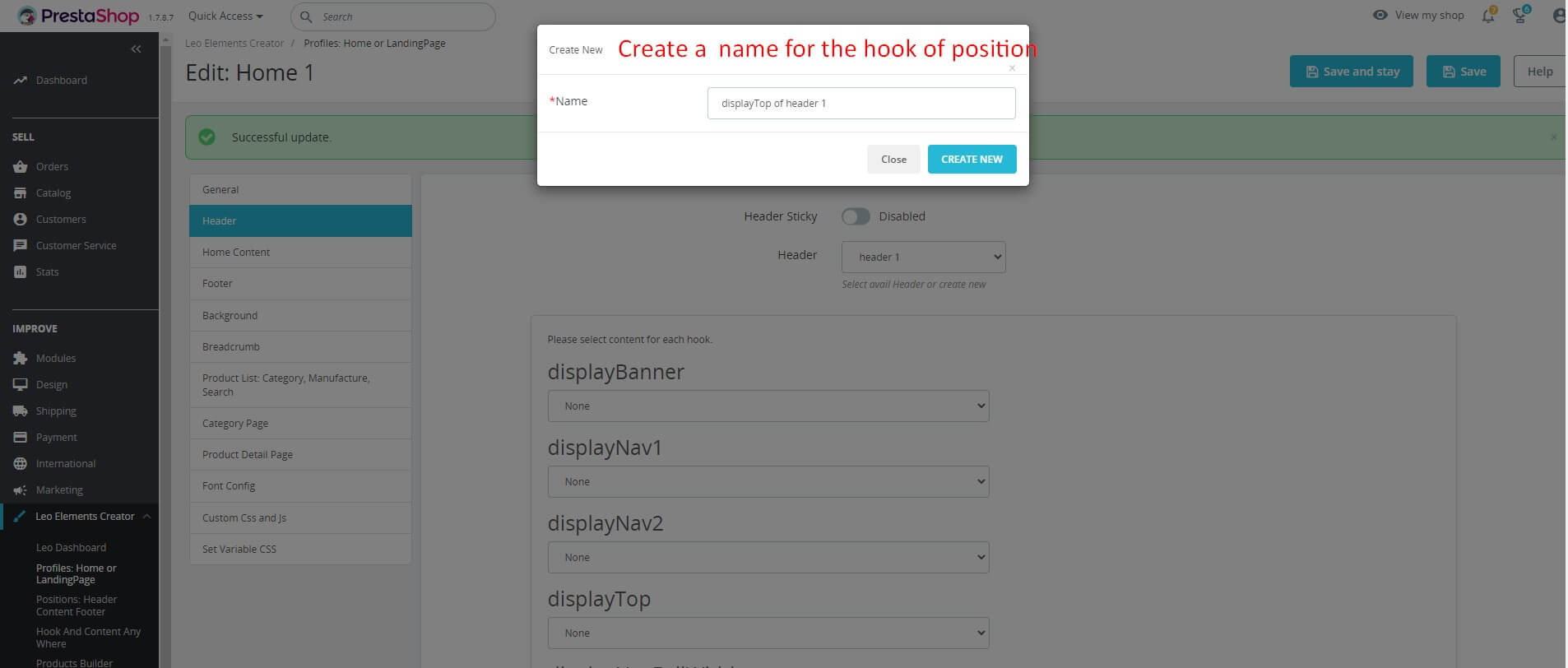
- After creating the position, Select the content for the weighing hook to use.
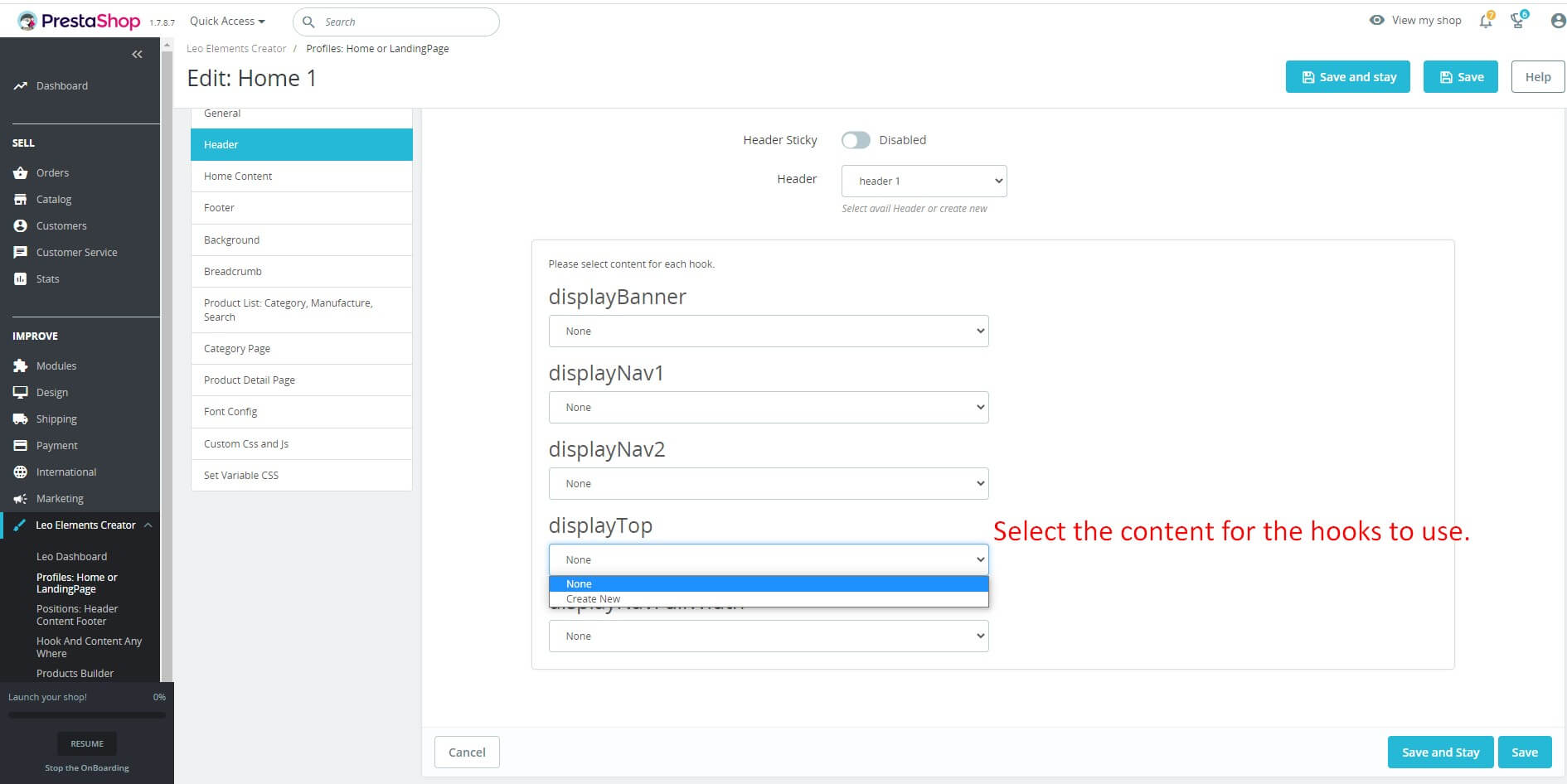
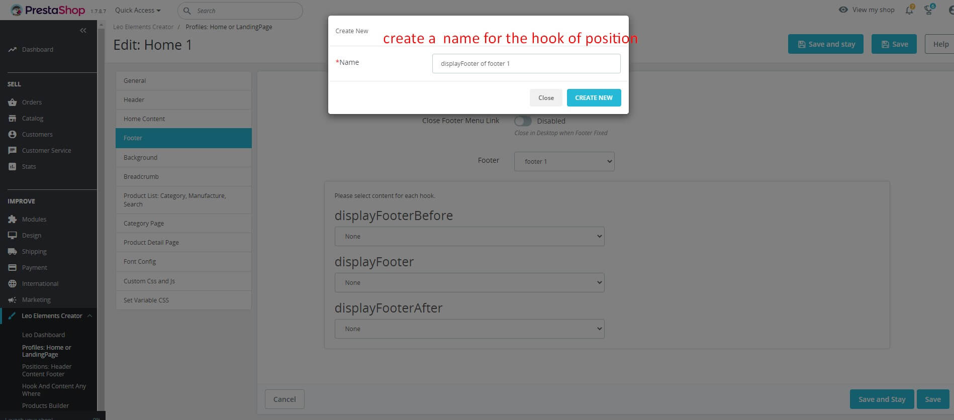
-Create a name for the hook of position.
- And here are our results
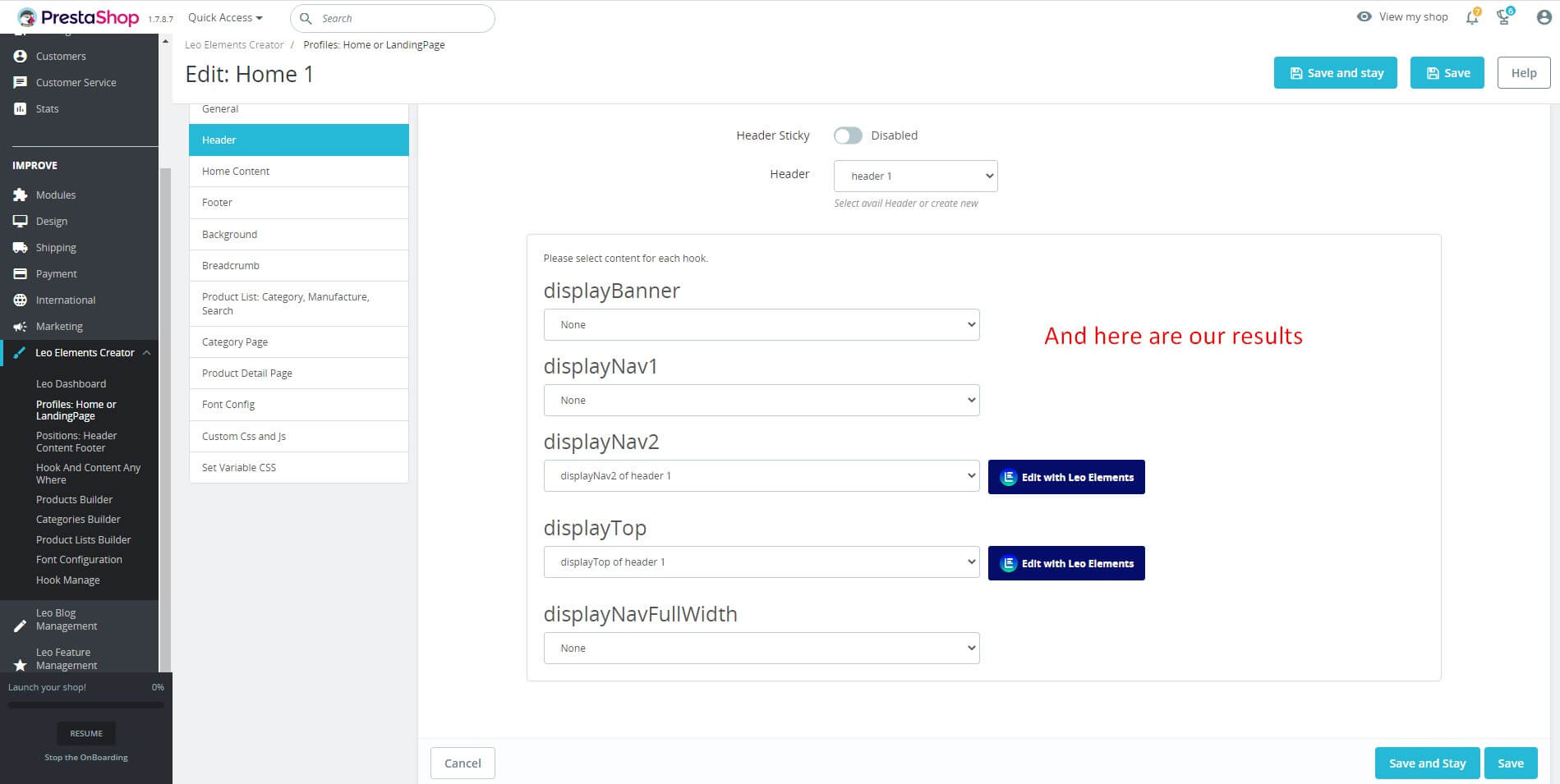
- Click "Save" button when you finish the process.
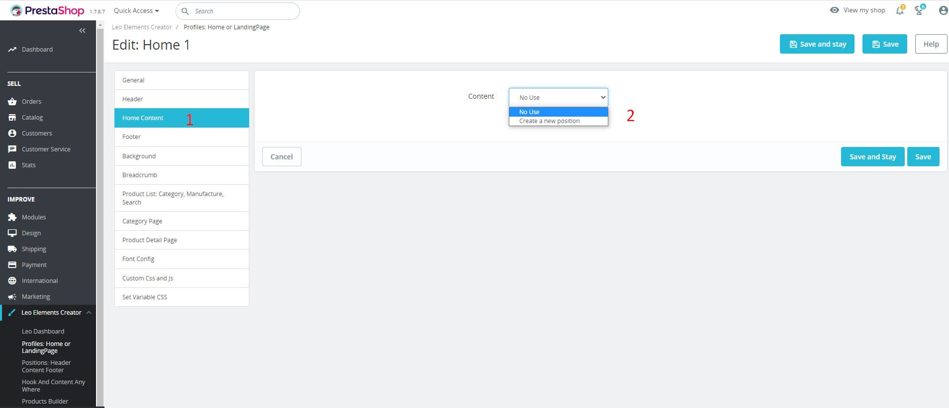
- Home Content
Content is the first factor to evaluate a quality website, it has many effects such as conveying a message, conveying a story, or also promoting a product, etc. Depending on the content of each website, we create a different content.
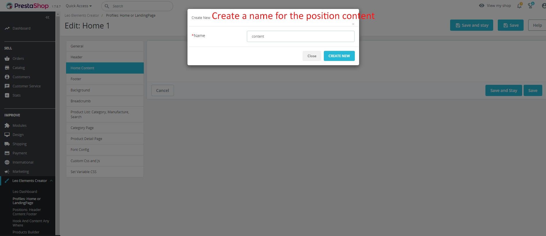
- Similar to the header, the content section also creates new content -> select content for each hook -> create a name for the hook of position.
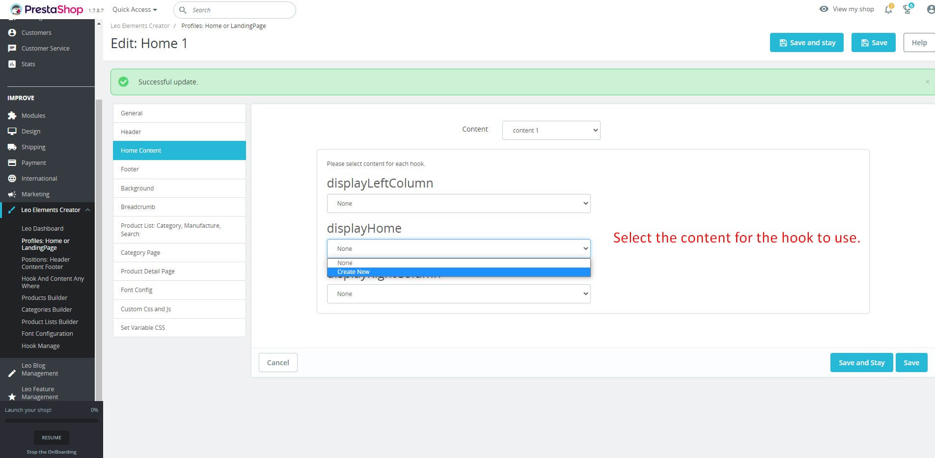
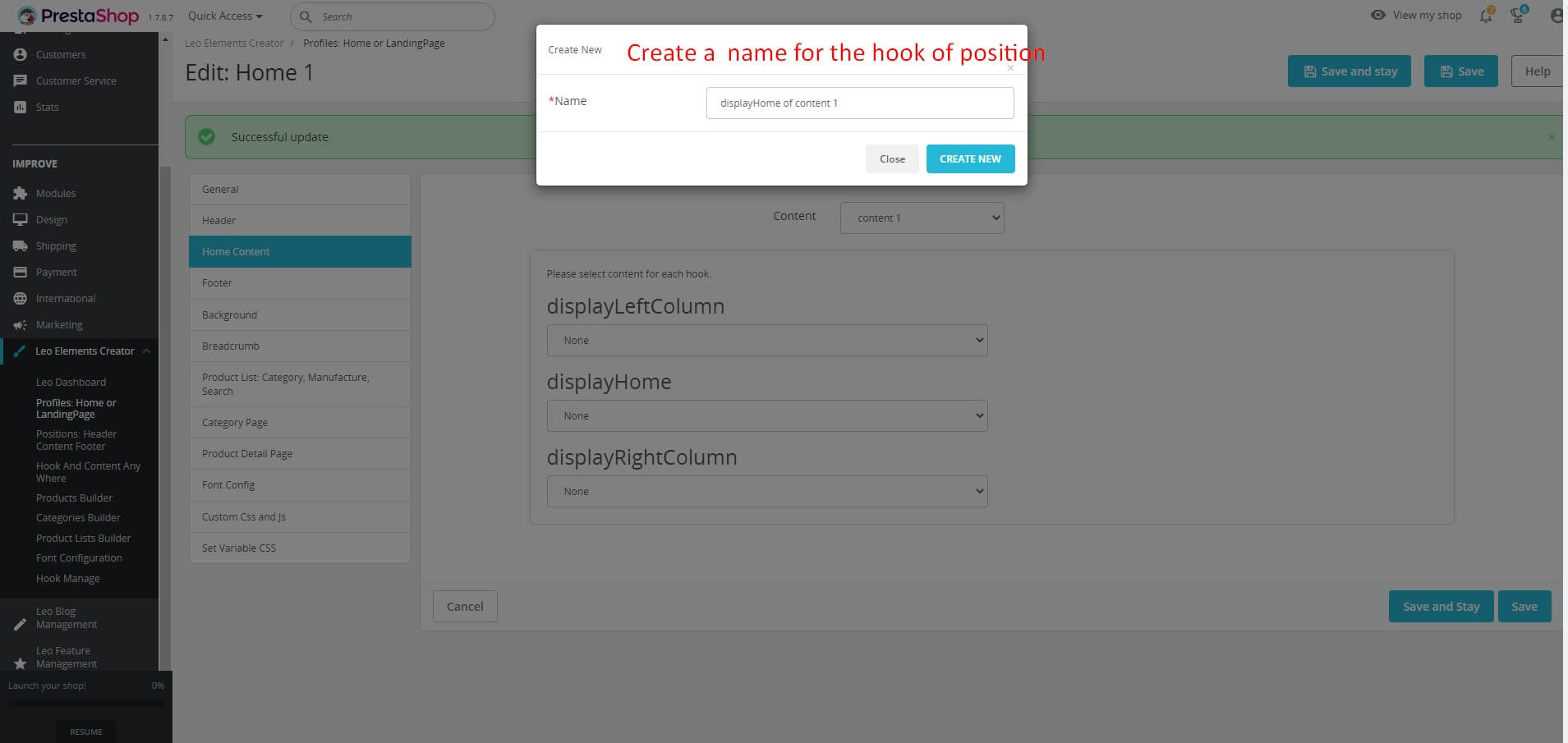
- And here are our results
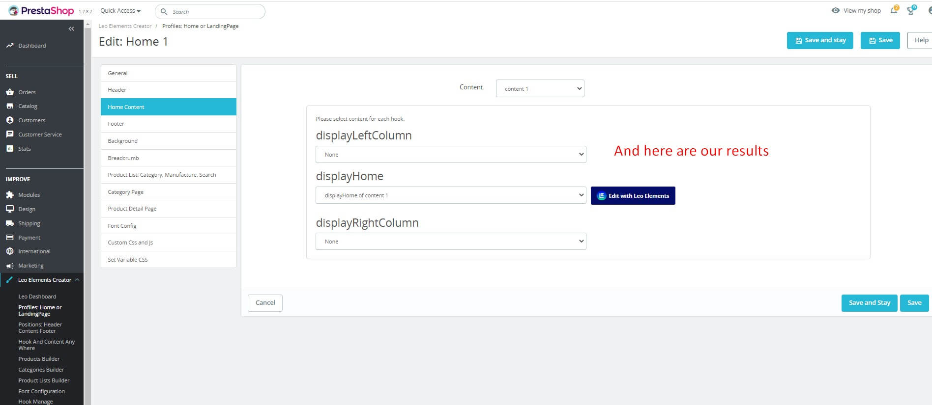
- Click "Save" button when you finish the process.
- Footer
Footer is the final part of a web page, displaying the same content on all pages of that website. The information displayed is very important and useful to the website owner.
- Similar to the header and content sections, we also have a new footer like the previous sections.
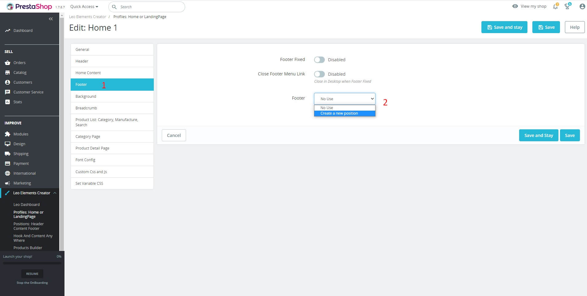
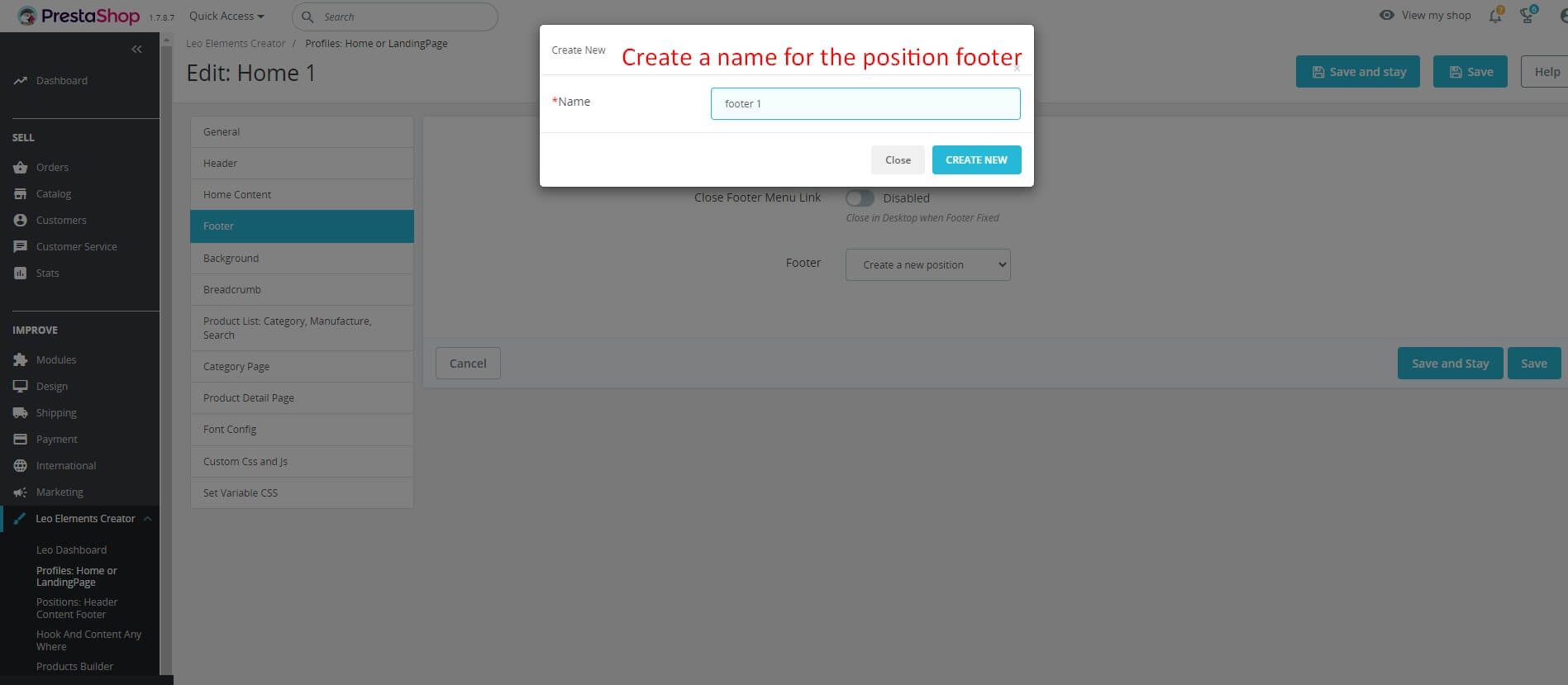
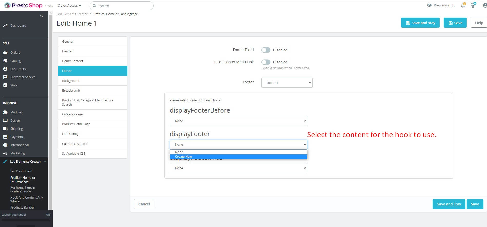
- And here are our results
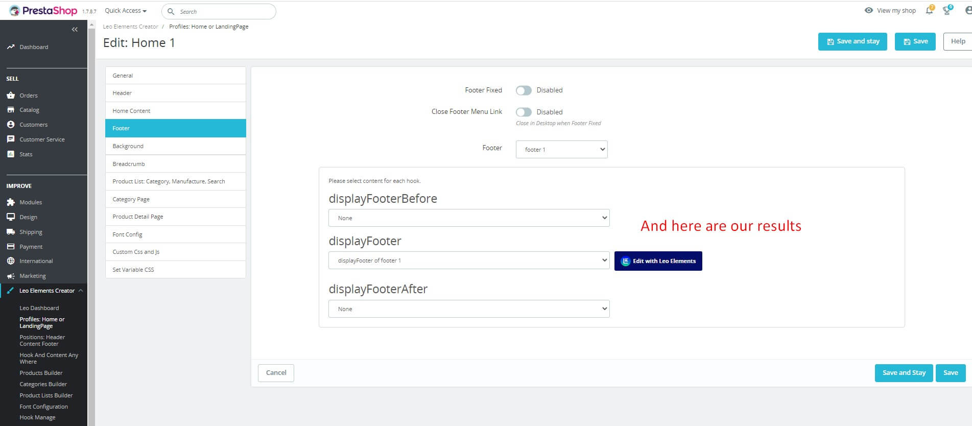
- Click "Save" button when you finish the process.
- Background

- Access the Background tab
- Correctly edit the background in full-width mode:
+ Background Color: Choose background color for website
+ Background image: Create a website background with an image. There are two ways is to insert the URL or select the file.
+ Background repeat: Choose the background repeat mode, there are many modes: Repeat-x, Repeat-y, Repeat-both or No-repeat.
+ Background attachment: Used to control the background image in relation to frames and elements.
+ Background size: Background-size defines the size of the background image, its value will be changed to fit the frame without causing scale deviation.
- Correctly edit the background in box mode:
+ Background Color: Choose background color for website
+ Background image: Create a website background with an image. There are two ways is to insert the URL or select the file.
+ Background repeat: Choose the background repeat mode, there are many modes: Repeat-x, Repeat-y, Repeat-both or No-repeat.
+ Background attachment: Used to control the background image in relation to frames and elements.
+ Background size: Background-size defines the size of the background image, its value will be changed to fit the frame without causing scale deviation.
- Click "Save" button when you finish the process.
- Breadcrumb
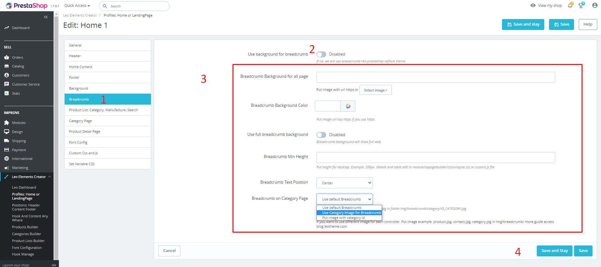
- Access the Breadcrumb tab
- Use background for breadcrumb: Select Enable to enable the use of background images for breadcrumbs
- Edit appropriate for your site:
+ Breadcrumb Background for all page: Create a website background with an image. There are two ways is to insert the URL or select the file.
+ Breadcrumb Background Color: Or you can also use background color for breadcrumb.
+ Use full breadcrumb background: After enable breadcrumb background will show full web.
+ Breadcrumb Min Height: Put height for it.
+ Breadcrumb Text Position: Select the text position of the breadcrumb.
+ Breadcrumb on Category Page: Choose the right mode for your website.
- Click "Save" button when you finish the process.
- Product List: Category, Manufacture, Search
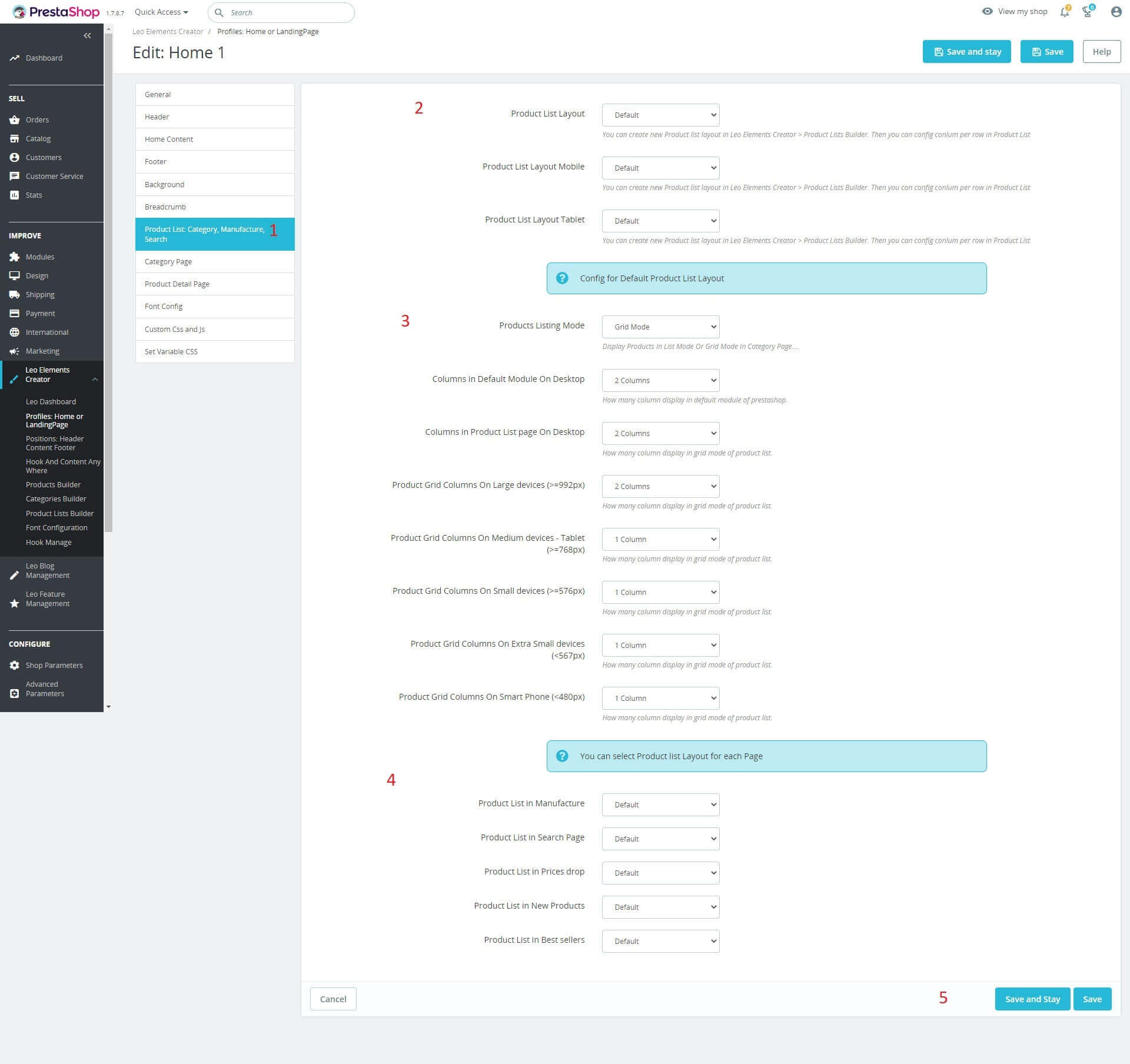
- Access the Product List: Category, Manufacture, Search tab
- You can create a new Product list layout in Leo Elements Creator > Product Lists Builder. Then you can config conlum per row in Product List.
- Config for Default Product List Layout
- You can select Product list Layout for each Page
- Click "Save" button when you finish the process.
- Category Page
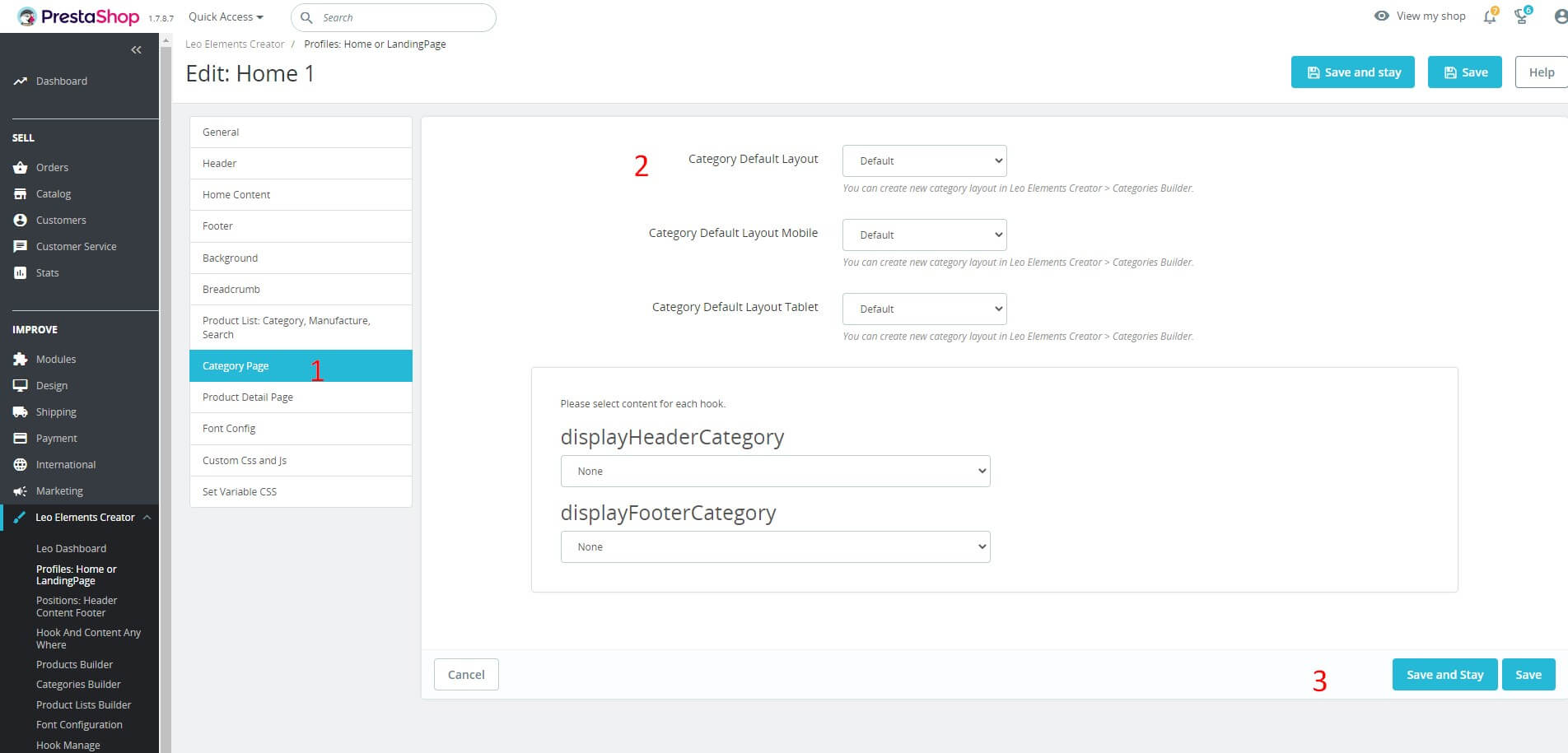
- Access the Category Page tab
- You can create new category layout in Leo Elements Creator > Categories Builder.
- Click "Save" button when you finish the process.
- Product Detail Page
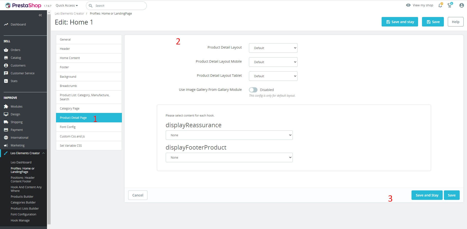
- Access the Product Detail Page tab
- You can create new category layout in Leo Elements Creator > Products Builder.
- Click "Save" button when you finish the process.
- Font Config
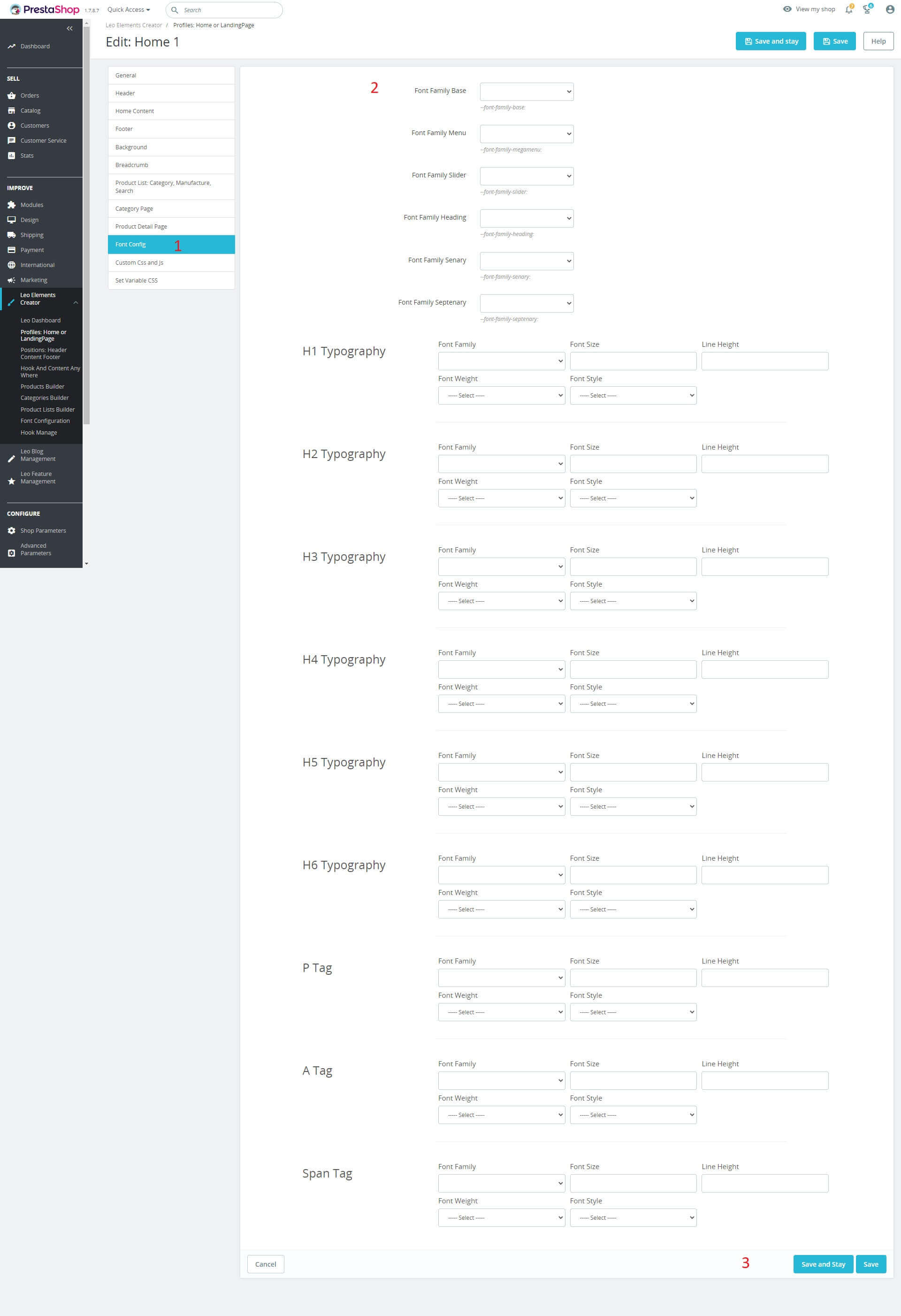
- Access the Font Config tab
- You can choose font-family according to their website, there are default font-family types or add the others, there are many cases with font-size, light-height, etc. default for each tag. Create your own website with your own style
- Click "Save" button when you finish the process.
- Custom Css and Js
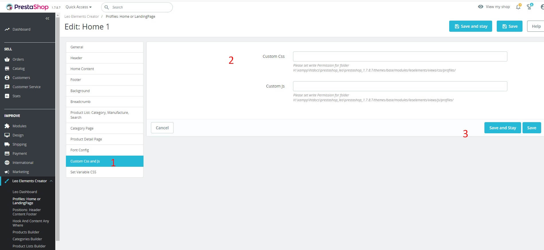
- Access the Custom Css and Js tab
- Custom Css: Please set write Permission for folder D:\xamp\htdocs\prestashop\module_appagebuilder/themes/classic/modules/appagebuilder/css/profiles/
- Custom Js: Please set write Permission for folder D:\xamp\htdocs\prestashop\module_appagebuilder/themes/classic/modules/appagebuilder/js/profiles/
- Click "Save" button when you finish the process.
- Set Variable CSS
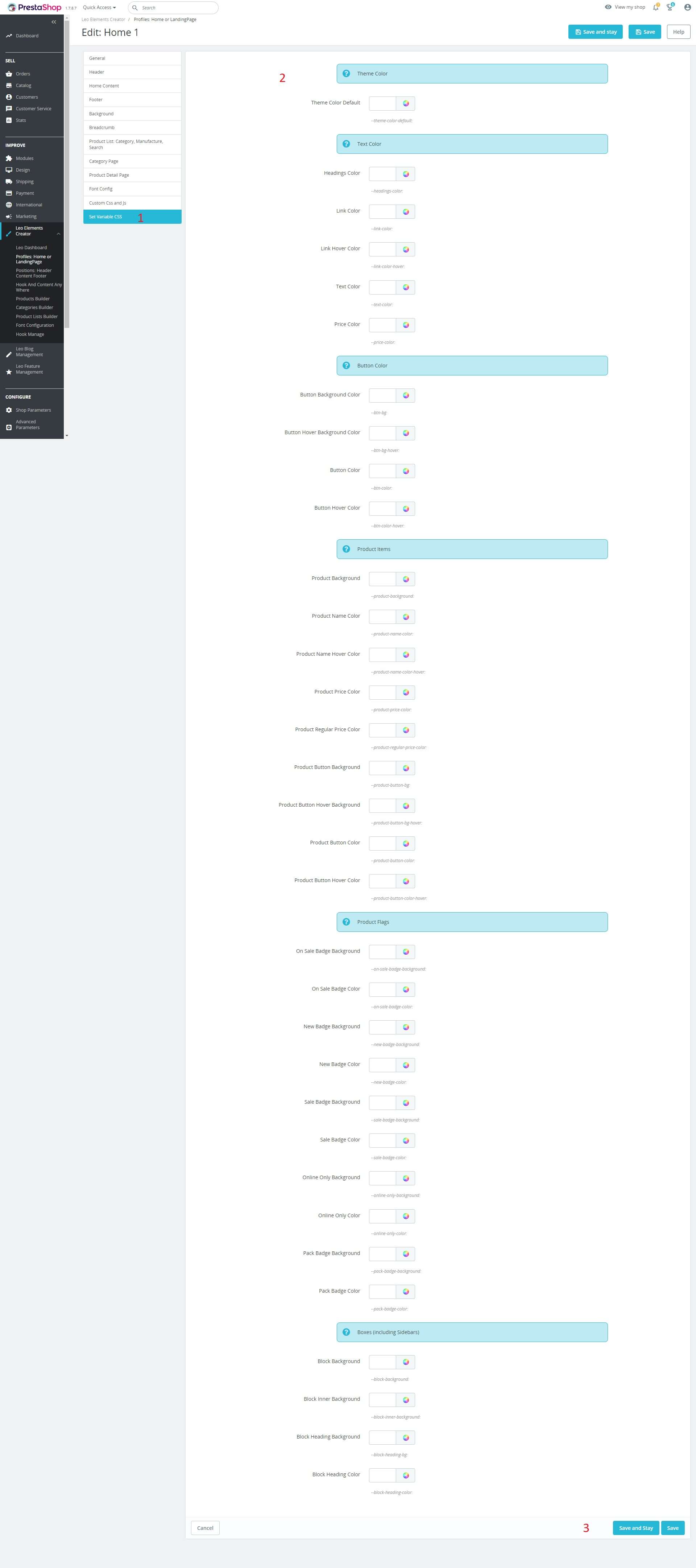
- Access the Set Variable CSS tab
- You can choose colors depending on their website, there are default colors for each element of the website. Create your own website with your own style.
- Click "Save" button when you finish the process.
- Leo Elementor Module Creates Multiple Landing Pages on Prestashop
- To create a new landing page, do the same with the Profiles: Home or LandingPage section above
- After following the steps mentioned earlier, we will get some results as follows:
- Click the "Save" button when you're done with the process. We will get more landing pages on Prestashop.
Positions: Header Content Footer
Used to manage the location of blocks on the page. (Leo Elements Creator > Positions: Header Content Footer)
- Add Position
To create a position, simply click on the "+" button.

Here you can fill in the following information.
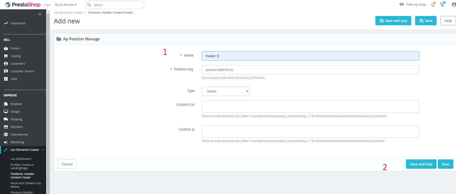
Name: Enter a name (This field is required).
Position Key: Use it to save as file name of css and js of Position
Type: Location displayed on the page.
Custom Css: Please set write Permission for folder D:/xamp/htdocs/prestashop/module_appagebuilder/themes/classic/modules/appagebuilder/css/positions/
Custom Js: Please set write Permission for folder D:/xamp/htdocs/prestashop/module_appagebuilder/themes/classic/modules/appagebuilder/js/positions/
- Click "Save" button when you finish the process.
- Edit
To configure the position click on "View"button.
Then choose "Edit", To edit the information of the location.
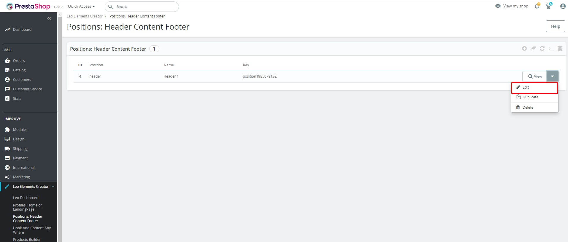
- Delete
To configure the position click on"View"button.
Then choose "Delete", To edit the information of the location.

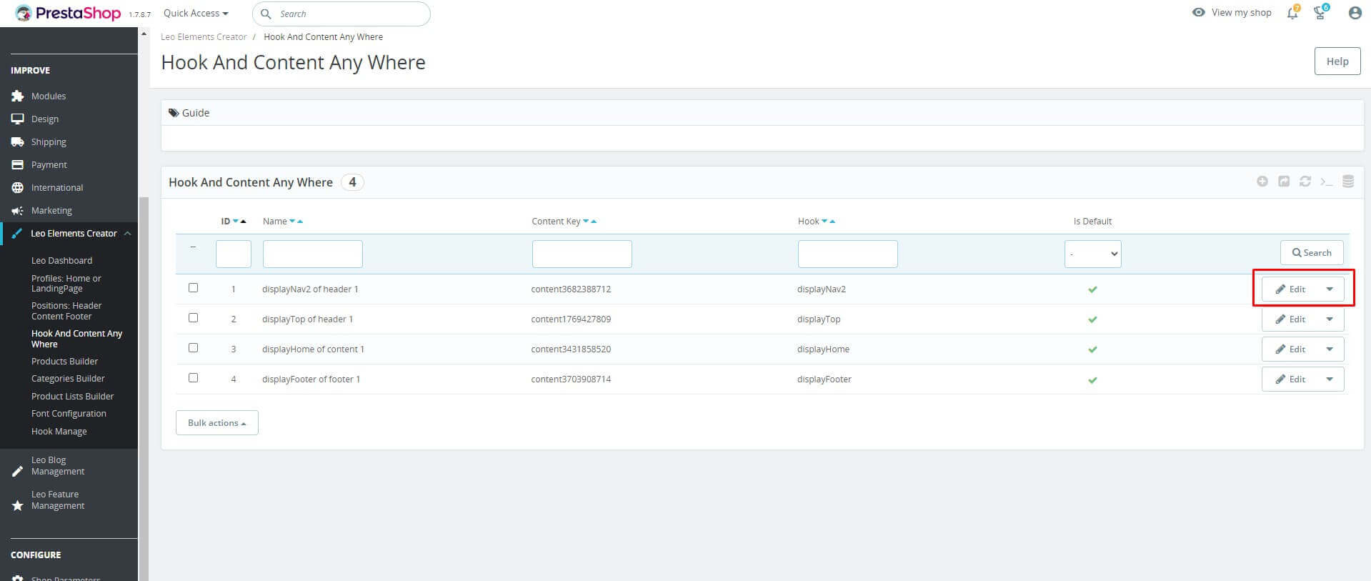
Hook And Content Any Where
Used to manage the location of blocks on the page. (Leo Elements Creator > Hook And Content Any Where)
- Add Hook
To create a position, simply click on the "+" button.

Here you can fill in the following information.

Name: Enter a name (This field is required).
Status: Status displayed on page.
Display Hook: Location displayed on the page.
- Click "Save" button when you finish the process.
- Edit
Then choose "Edit", To edit the information of the location.
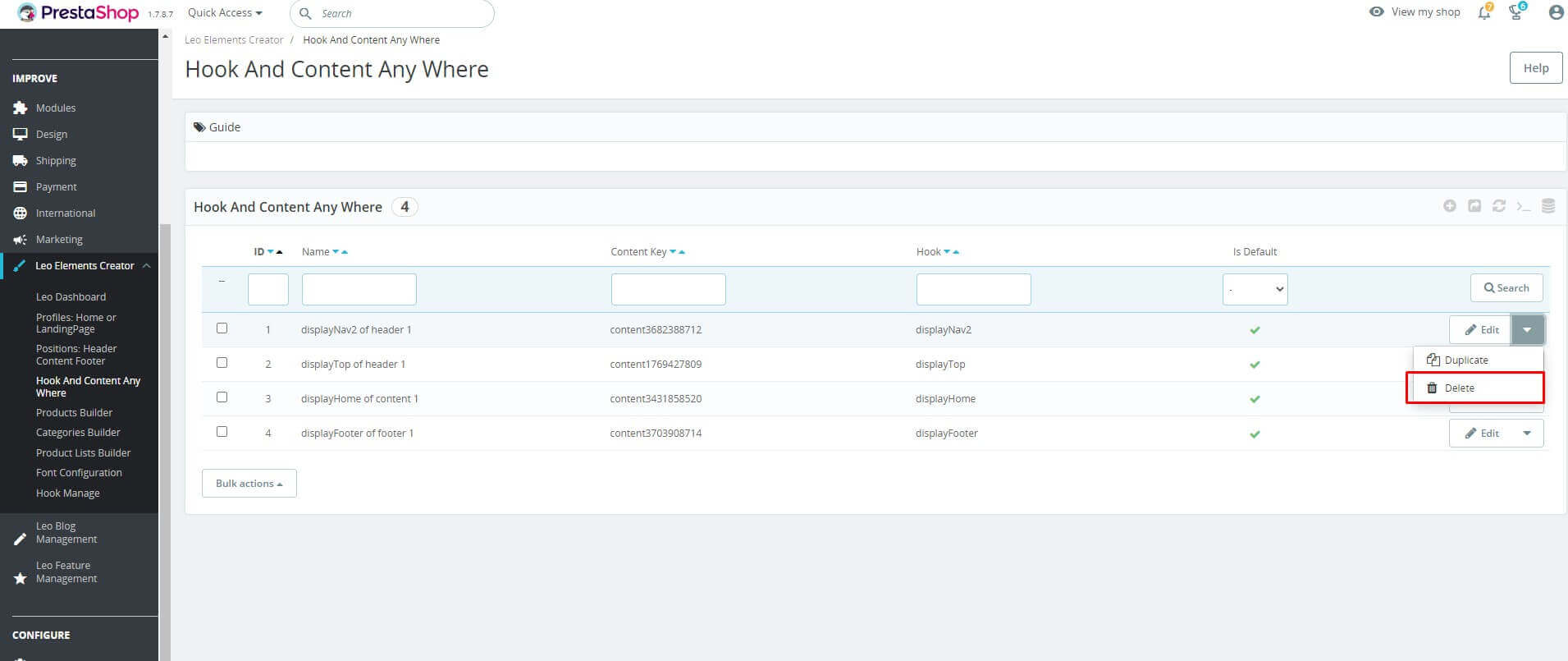
- Delete
To configure the position click on "Edit"button.
Then choose "Delete", To edit the information of the location.
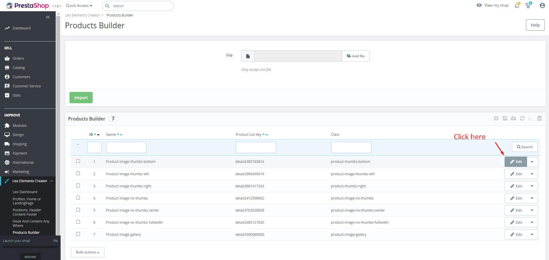
Products Builder
Used to manage the product detail. (Leo Elements Creator > Products Builder).
- Add Product Detail
- Access the Products Builder tab.
- Select the file you want to import on your computer -> The next step is to click the "Import" button.
- Or select add new to create a new product detail.

Here you can fill in the following information.
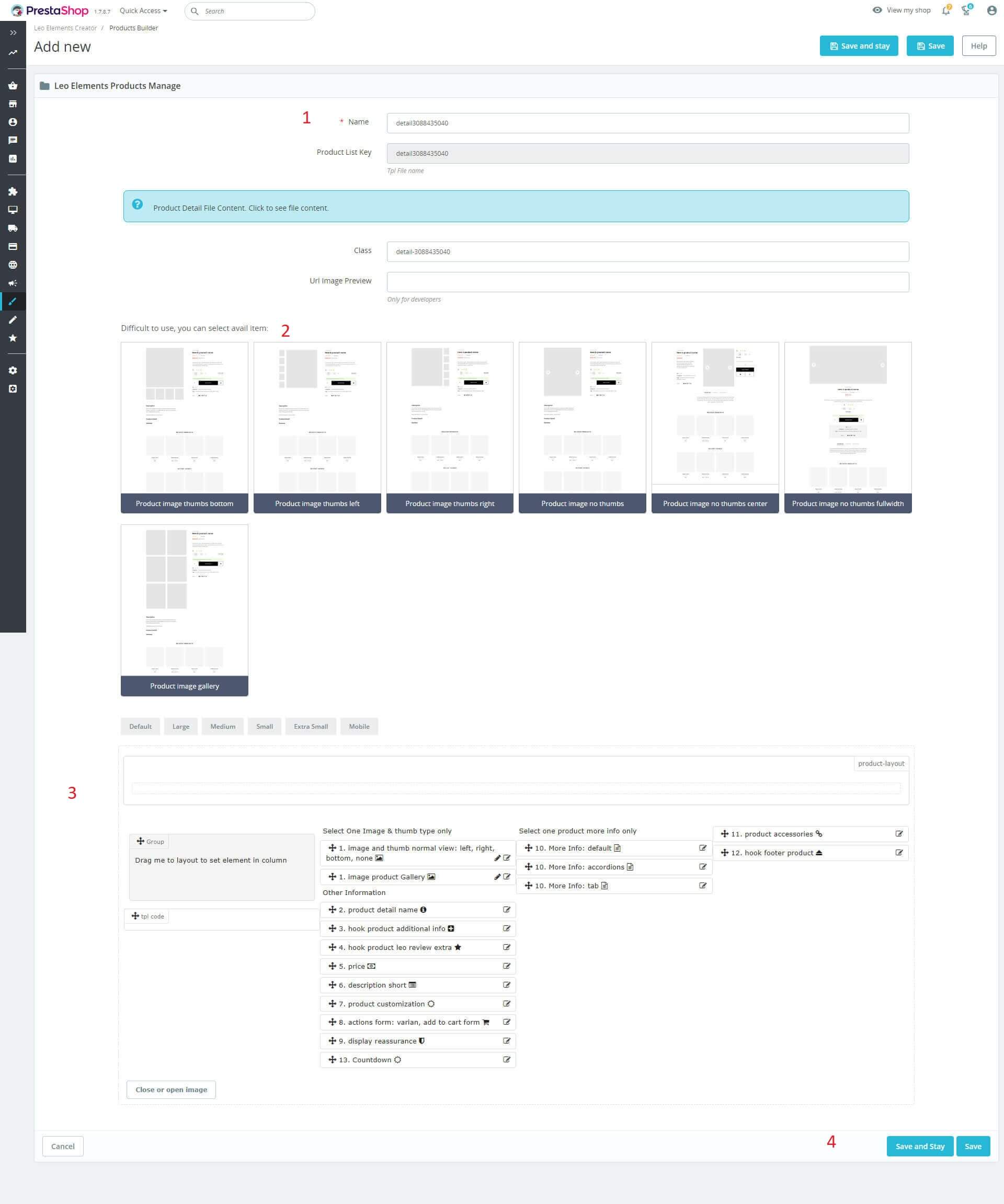
- Name: Enter a name (This field is required).
- Product List Key: The character string of product key.
- Difficult to use, you can select avail item.
- Or you can create a new product detail yourself.
- Click "Save" button when you finish the process.
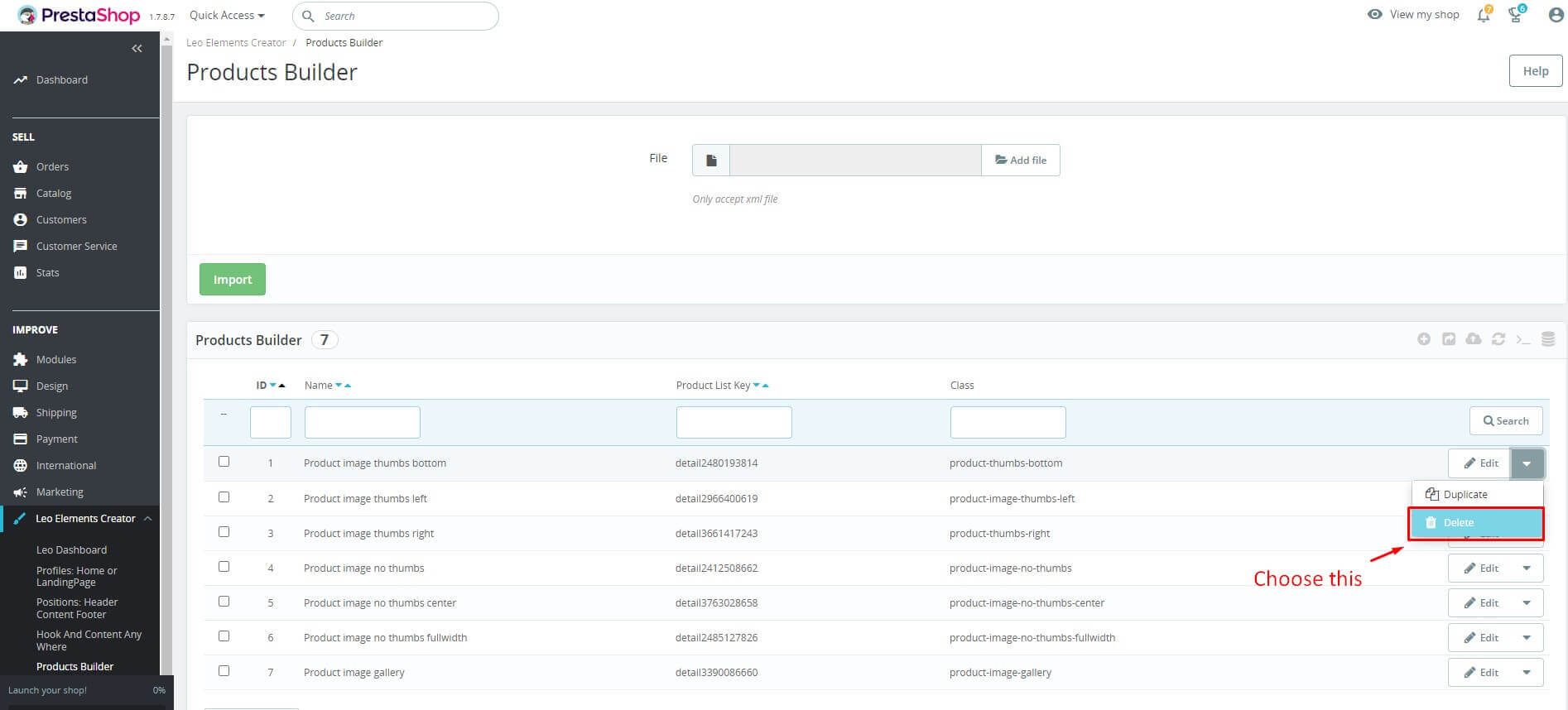
- Edit
Then choose "Edit", To edit the information of the location.
- Delete
To configure the position click on "Edit"button.
Then choose "Delete", To edit the information of the location.
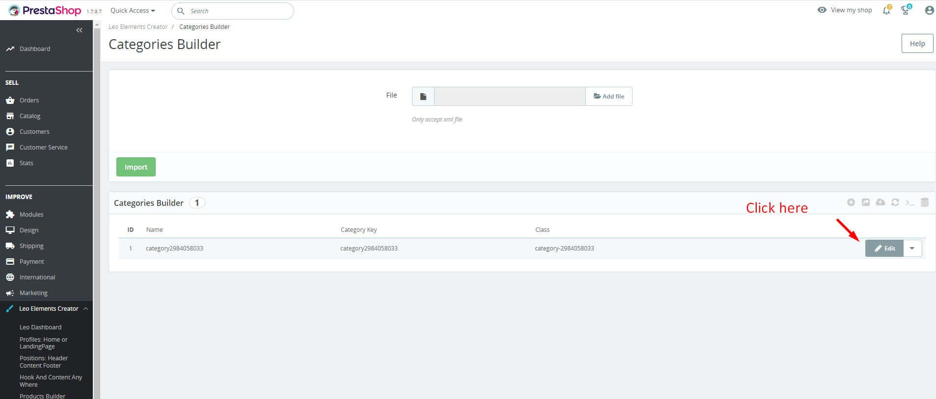
Categories Builder
Used to manage the category detail. (Leo Elements Creator > Categories Builder).
- Add Category
- Access the Categories Builder tab.
- Select the file you want to import on your computer -> The next step is to click the "Import" button.
- Or select add new to create a new category.

Here you can fill in the following information.
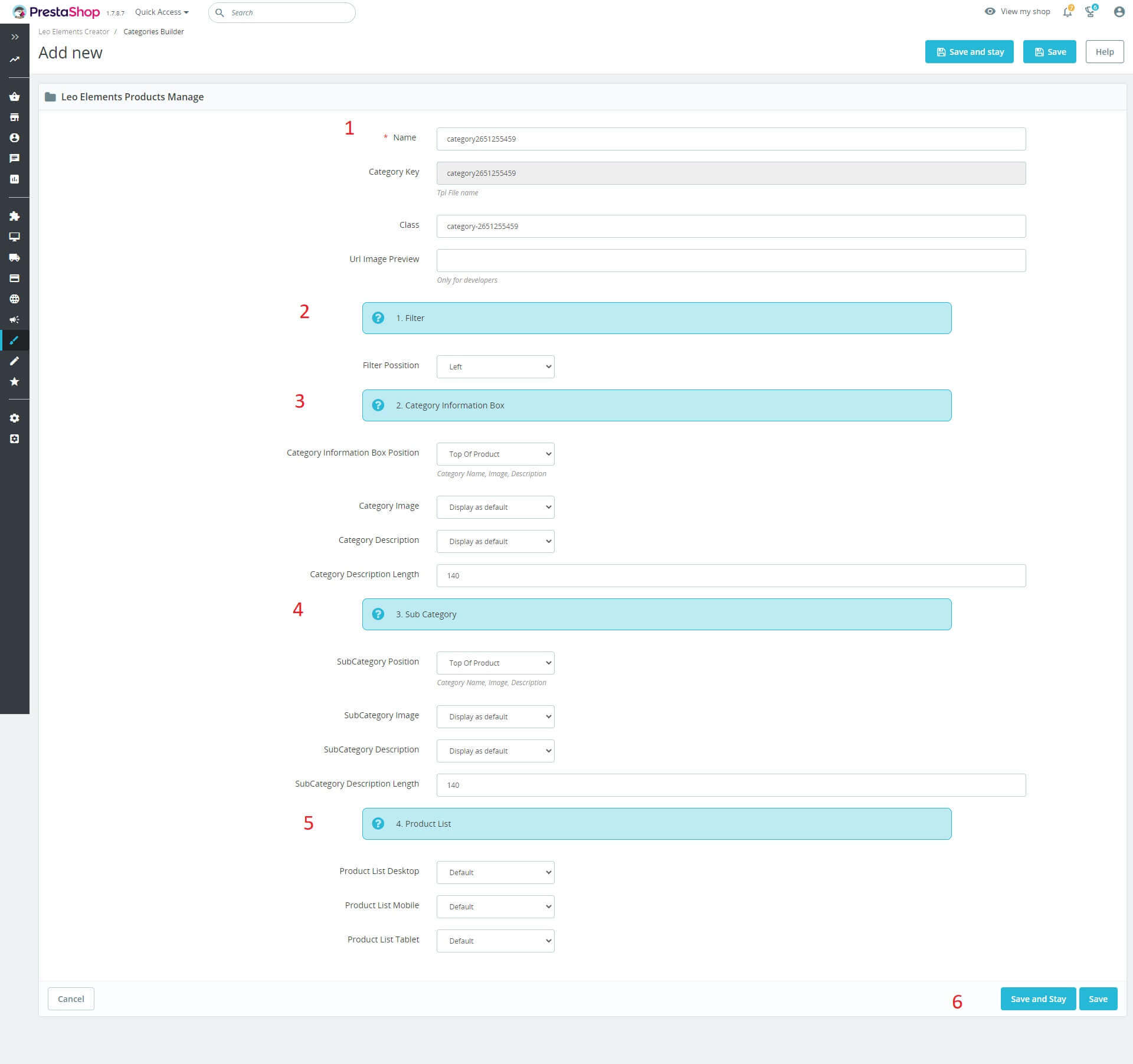
- Name: Enter a name (This field is required).
- Category Key: The character string of category key.
+ Filter: The position of the filter will be displayed on the page.
+ Category Information Box: Including information about the category (image, description, display location, etc.), unleash your creativity
+ Sub Category: Including information about sub-categories (images, descriptions, display locations, etc.), unleash your creativity
+ Product List: The product list will be displayed in the category for each device.
- Click "Save" button when you finish the process.
- Edit
Then choose "Edit", To edit the information of the location.
- Delete
To configure the position click on "Edit"button.
Then choose "Delete", To edit the information of the location.

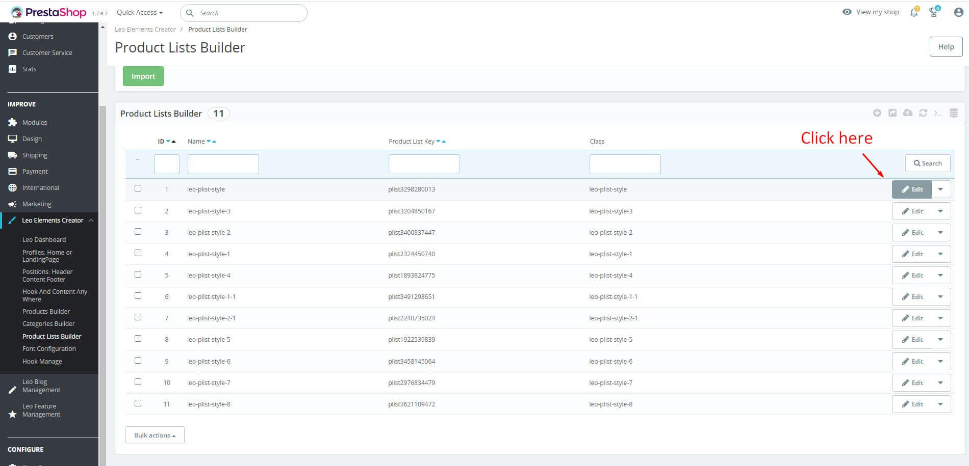
Product Lists Builder
Used to manage the product lists. (Leo Elements Creator > Product Lists Builder).
- Add Product List
- Access the Product Lists Builder tab.
- Select the file you want to import on your computer -> The next step is to click the "Import" button.
- Or select add new to create a new product lists.

Here you can fill in the following information.

- Name: Enter a name (This field is required).
- Product List Key: The character string of product key.
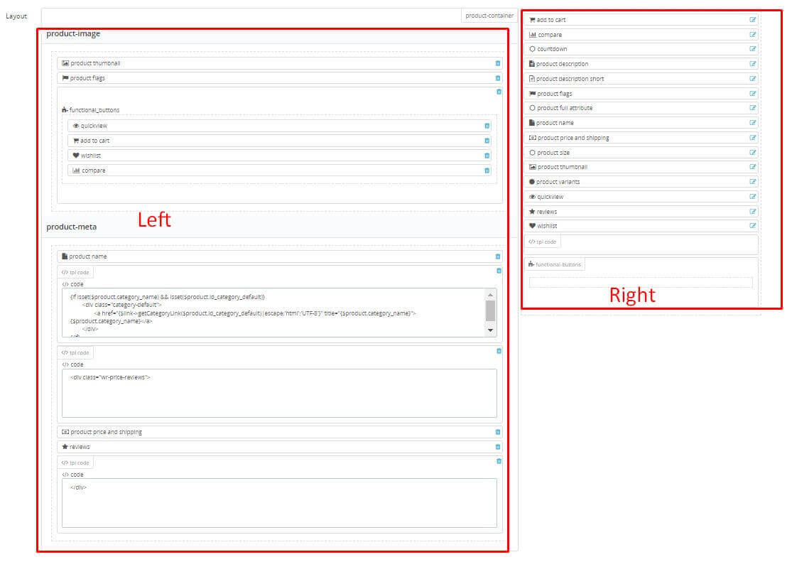
+ Product List File Content: This section will have the class properties of the product list, Products Listing Mode, set the number of columns for each screen of the devices.
Class: Class used to style the product.
+ Top function Config: Category, manufacturer, search.
+ Paging: Category, manufacturer, search
+ Run Ajax: This section to enable image display or countdown etc.
+ Other features: Use Swipe image (Mobile - You can swipe the product photo in product list.)
+ Difficult to use, you can choose to Import From Demo Product List
+ Or you can create a new product list yourself:
Layout: The frame contains elements.
Product_description_short: Short description of the product.
Product_flags: Display label on product.
Product_name: Name of product.
Product_price_and_shipping: Price and shipping.
Product_thumbnail: Show small image of the product.
Quickview: Used to view the product, when customers click on the product it will display a popup describing the specific product.
Tpl code: Used to add code to the frame "Tpl code".
Functional-buttons: To Create group covers outside, we also create ".functional-buttons" class.
You can drag and drop elements from the right-hand frame to the left-hand side. To create product followed design.
For example, you can drag and drop elements from the layout as image below:
- Click "Save" button when you finish the process.
- Edit
Then choose "Edit", To edit the information of the location.
- Delete
To configure the position click on "Edit"button.
Then choose "Delete", To edit the information of the location.

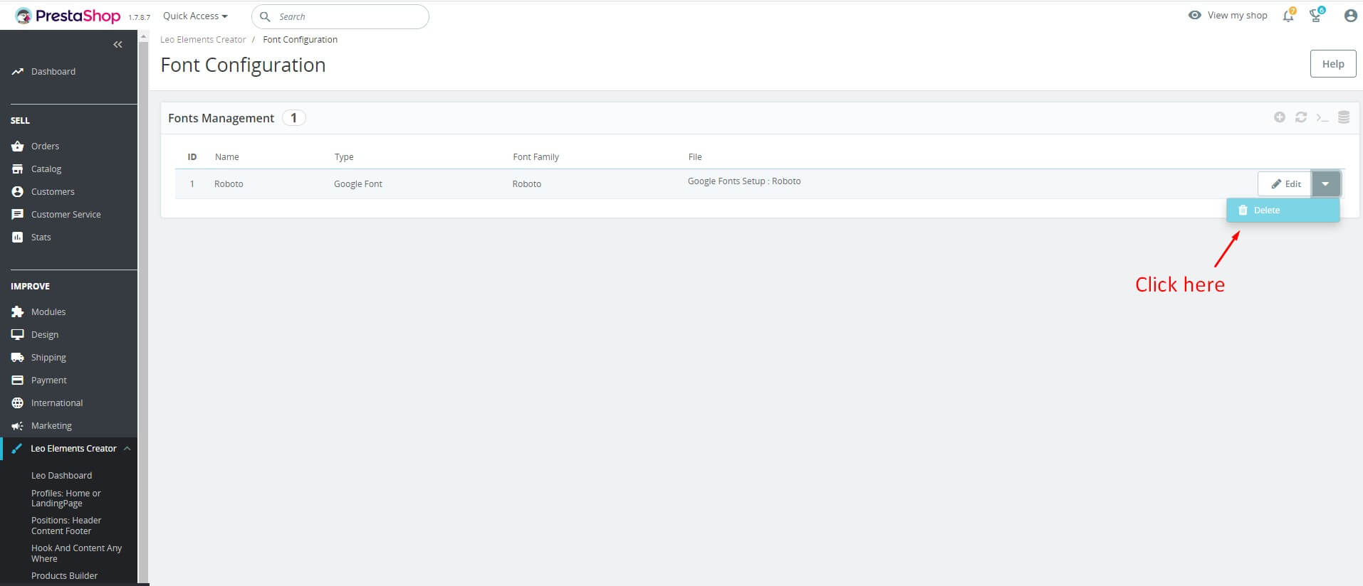
Font Configuration
Used to manage the font family. (Leo Elements Creator > Font Configuration).
- Add Font
- Access the Product Lists Builder tab.
- Click '+' button on right corner of the screen to create."Add new"
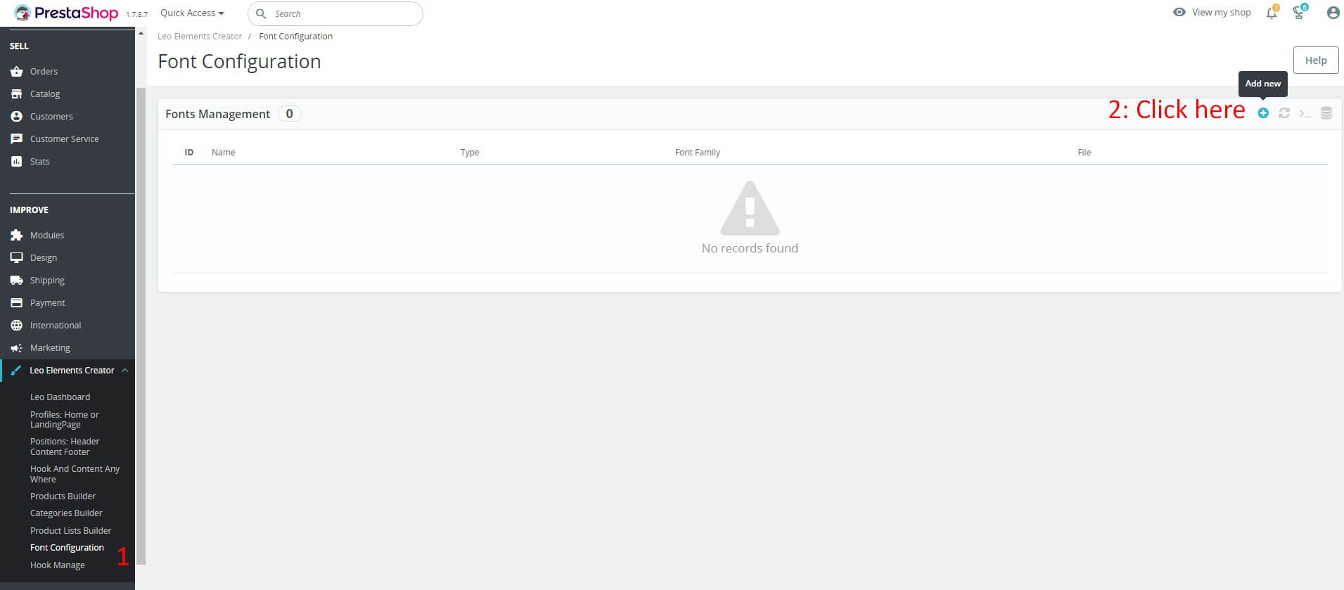
Here you can fill in the following information.
- Name: Enter a name (This field is required).
- There are two ways to add new font families:
+ Case 1: Upload your font file
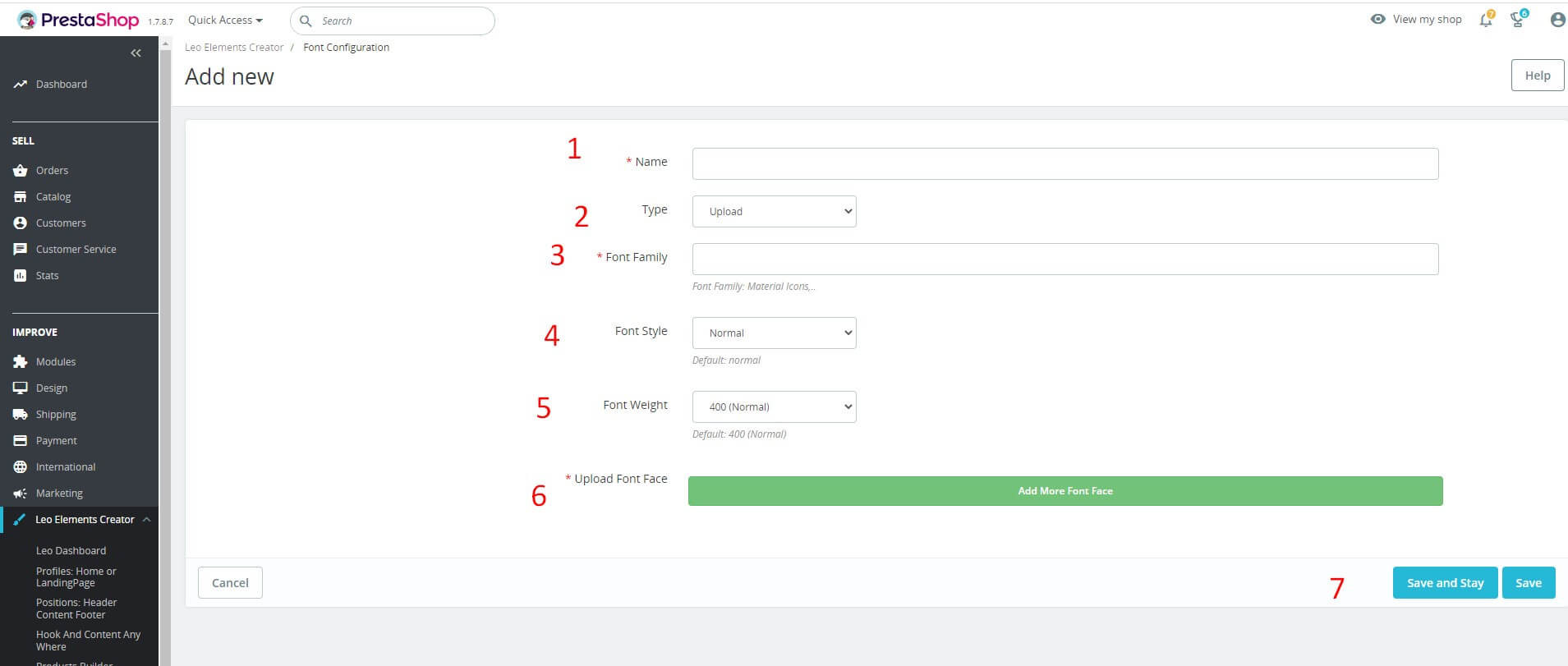
Select full information such as font-style, font-weight, etc. Upload the full font file.
+ Case 2: Use the available font of google font
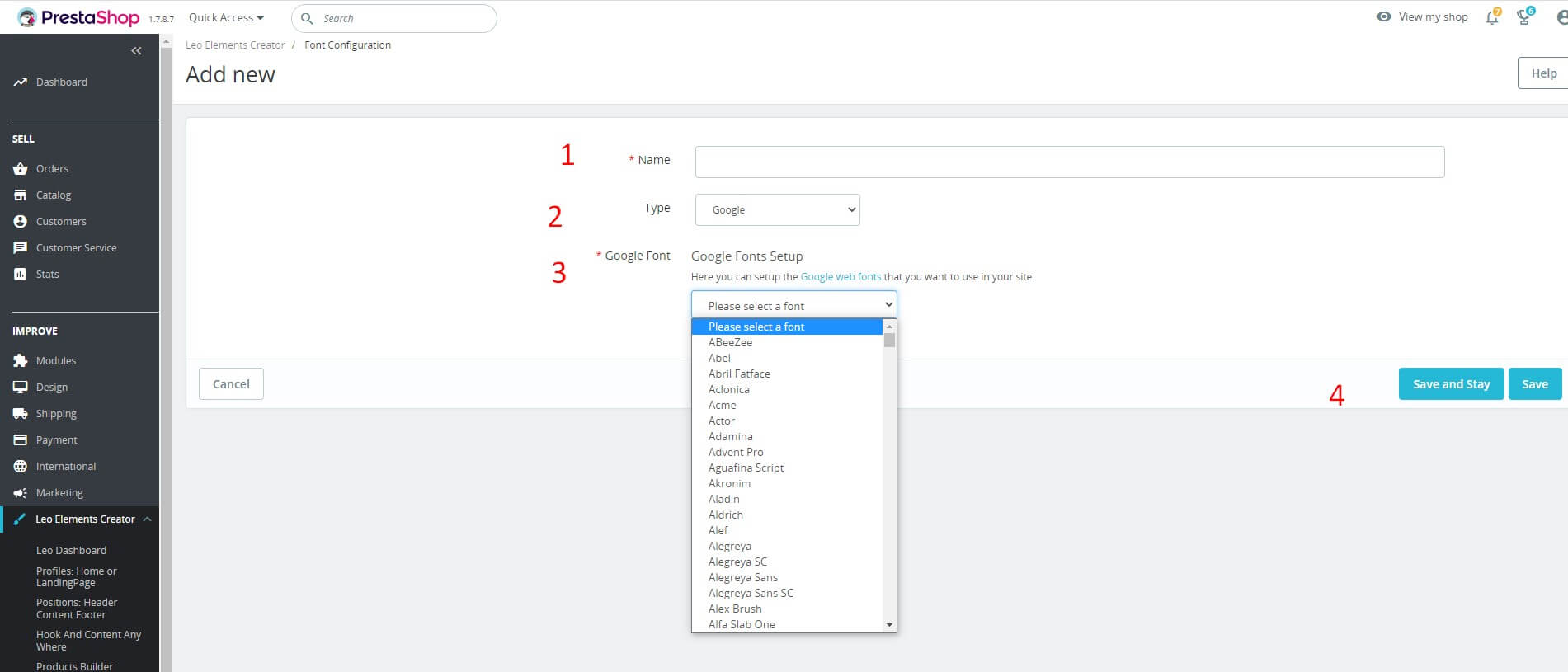
- Click "Save" button when you finish the process.
- Edit
Then choose "Edit", To edit the information of the location.

- Delete
To configure the position click on "Edit"button.
Then choose "Delete", To edit the information of the location.
Hook Manage
Used to manage the hook. (Leo Elements Creator > Hook Manage).
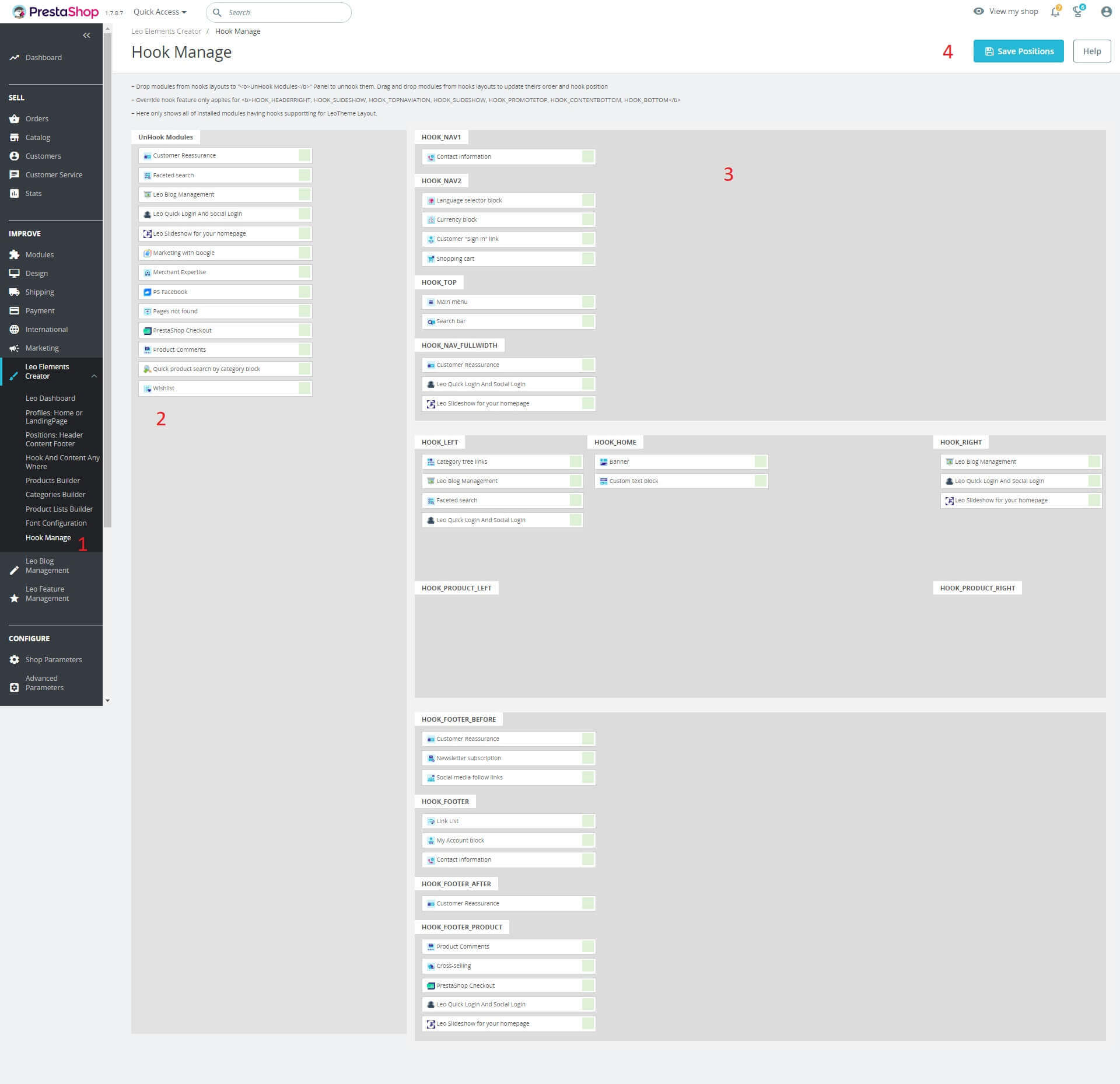
+ Drop modules from hooks layouts to "UnHook Modules" Panel to unhook them. Drag and drop modules from hooks layouts to update theirs order and hook position
+ Override hook feature only applies for HOOK_HEADERRIGHT, HOOK_SLIDESHOW, HOOK_TOPNAVIATION, HOOK_SLIDESHOW, HOOK_PROMOTETOP, HOOK_CONTENTBOTTOM, HOOK_BOTTOM
+ Here only shows all of installed modules having hooks supportting for LeoTheme Layout.
Edit with Creative Elements
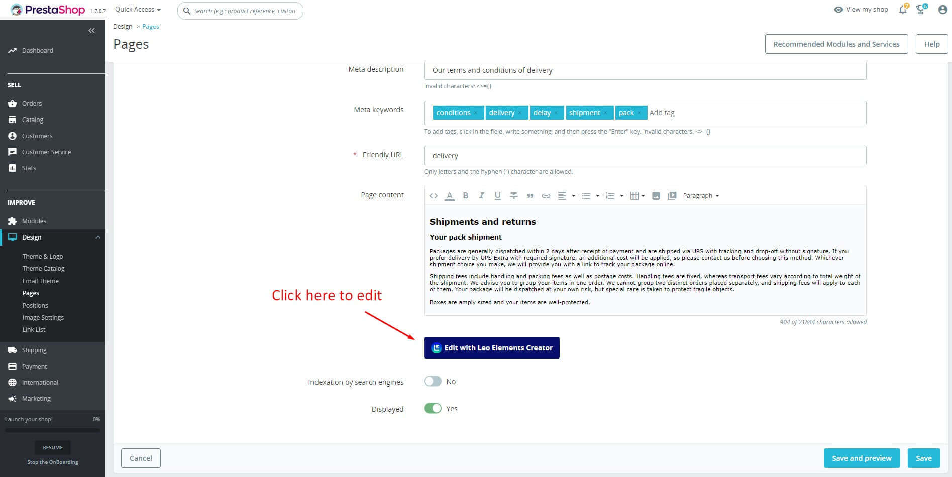
Edit an existing CMS Page
- Access the Design tab -> Page

- Click the button "Edit with Leo Elements Creator" to edit cms page.
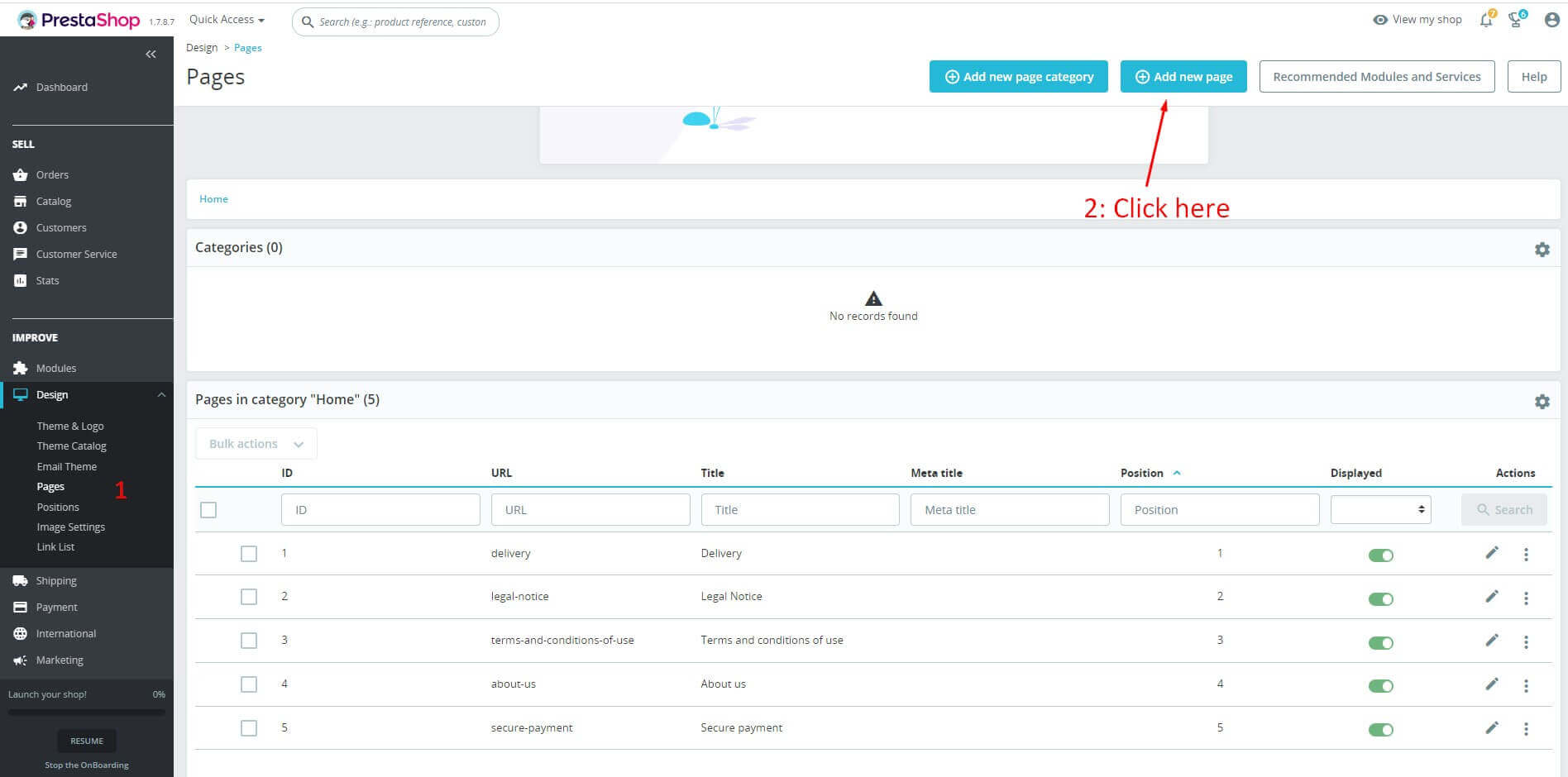
Edit a New CMS Page
- Access the Design tab -> Page -> click button "Add new page"
Fill in the information for the new page
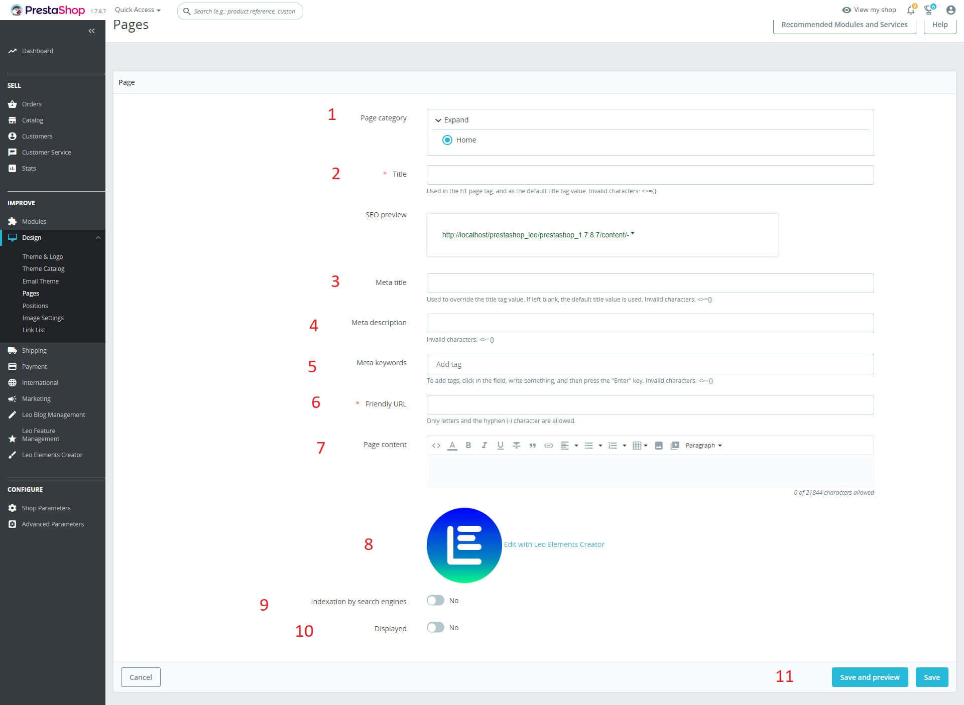
- Page category: Choose category for page.
- Title: Title of page
- Meta title: Used to override the title tag value. If left blank, the default title value is used.
- Meta description: Enter the meta description of the page.
- Meta keywords: To add tags, click in the field, write something, and then press the "Enter" key.
- Friendly URL: Only letters and the hyphen (-) character are allowed.
- Button "Edit with Leo Elements Creator": Click it to enter live edit.
- Indexation by search engines.
- Display: Hide or Show new page.
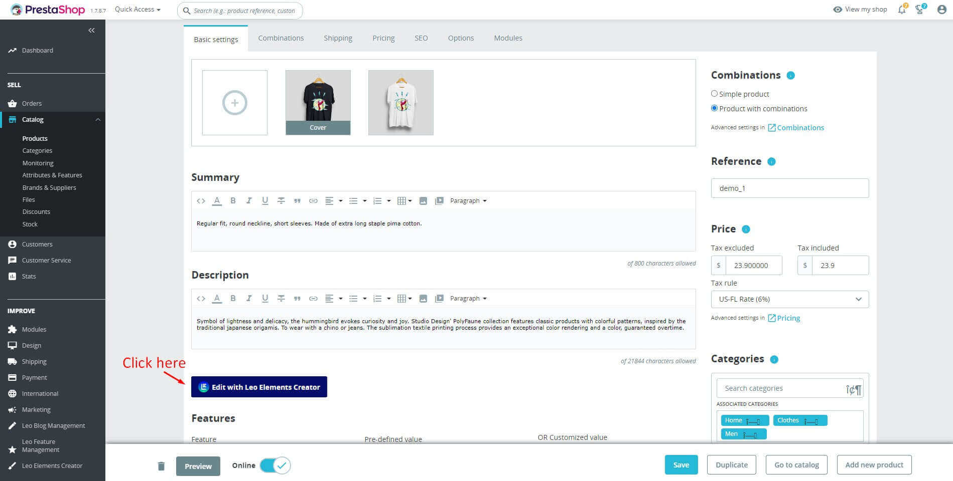
Edit Product description
- Access the Catalog tab -> Products -> click icon "pencil"
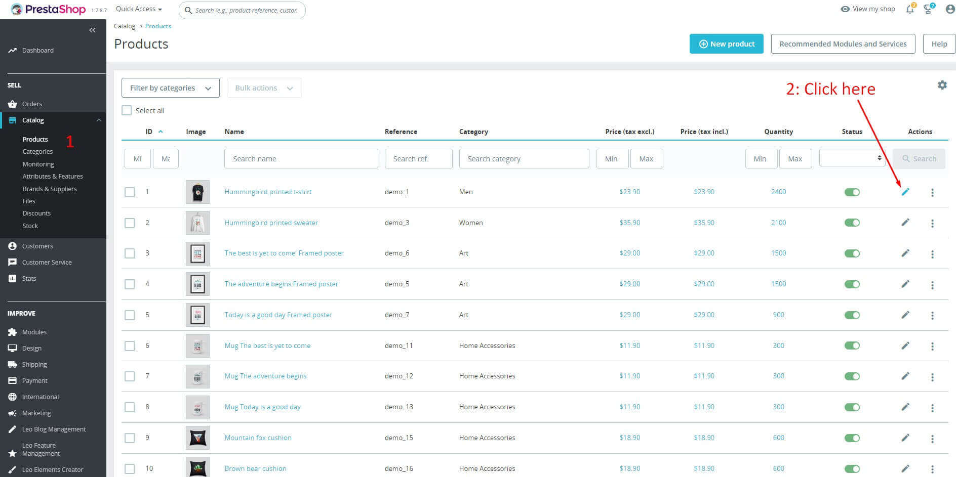
- And click button "Edit with Leo Elements Creator" in page Product to enter live edit.
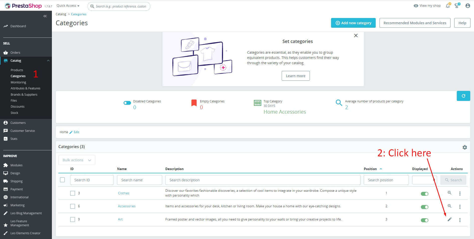
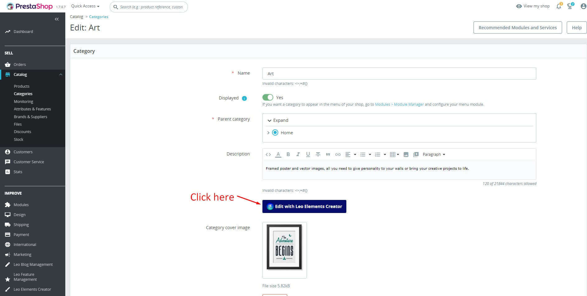
Edit Category description
- Access the Catalog tab -> Categories -> click icon "pencil"
- And click button "Edit with Leo Elements Creator" in page Categories to enter live edit.
Page Layout
To create page designs with Creative Elements, we use 3 types of elements: Sections, Columns and Widgets. Combining these elements lets you design and compose very complex web pages. You can control and edit the appearance of each of them. Sections are the largest building blocks, and inside them are groups of Columns. Columns sit inside of Sections and are used to house the Widgets. Widgets are placed inside of Columns. You control the Section, Column, and Widgets with their handle.
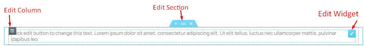
Handle icons lets you:
- Edit and customize each of the elements.
- Move an element up or down the page.
- Duplicate, add, save, or delete an element.
Explore our elements.
Section
A section is the most basic element that you can work with. It's the building block of every page. A section can be set as full width and spread all over the screen, or receive the content area width (by default). After you create a section you can drag and drop a widget inside. You can also divide each section to few columns. Every page you create can contain as many sections as you want. You can drag a section above or under another one to relocate it.
Column
Every section includes one or more columns. You are able to insert your content inside each column. You can easily arrange and order the columns, simply by dragging and dropping them.
Edit Category description
Widgets are different UI items, which enable the website to perform a function or just display information. You can insert Widgets inside Columns, a Widget width is set by the Column width.
Here is the list of the currently available widgets:
- Products ( Carousel / Grid )
- Products Tabs ( Carousel / Grid )
- Block Link
- Generate Code
- Block Carousel
- Manufacturers Carousel
- CountDown
- Leo Slideshow Module
- Leo Megamenu Module
- Leo Blog Module
- Module
- Inner Section
- Heading
- Image
- Text Editor
- Video
- Button
- Divider
- Spacer
- Google Maps
- Icon
- Image Box
- Icon Box
- Star Rating
- Icon List
- Counter
- Progress Bar
- Testimonial
- Tabs
- Accordion
- Toggle
- Social Icons
- Alert
- HTML
- Menu Anchor
Section Overview
Edit Section icons
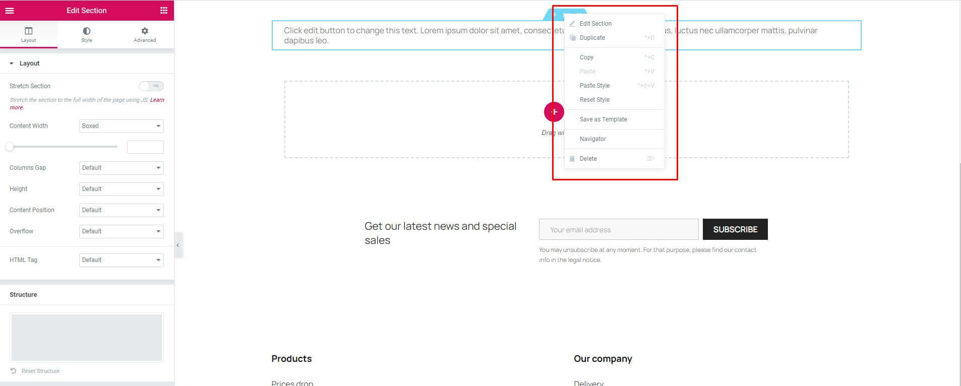
- Drag Section: Move the Section up or down with a simple drag & drop.
- Duplicate: Duplicate the Section with only one click.
- Save: Save the section into your Template Library.
- Remove: Delete Section from page.
Layout Tab
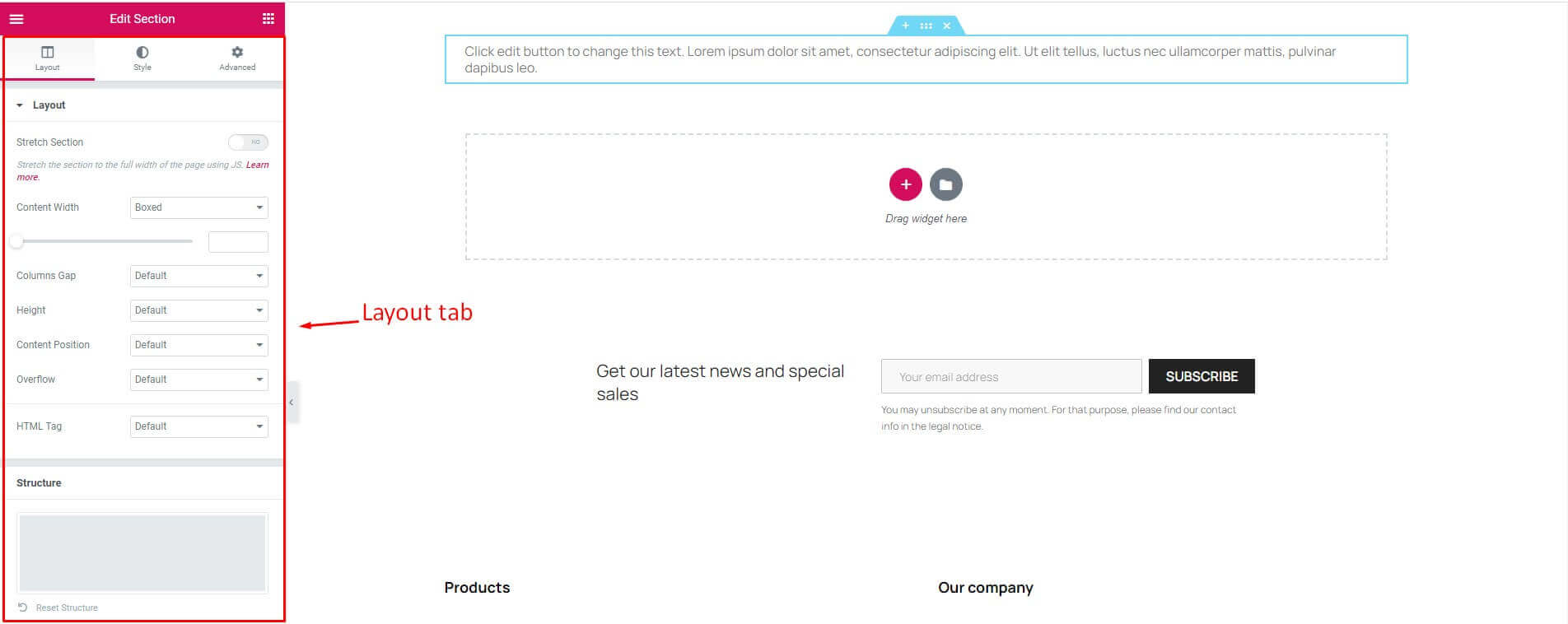
- Stretch Section: Force the Section to stretch to the full width of the page.
- Content Width: Set the Content Width to Boxed or Full Width. When choosing Boxed - use the slider to set your width.
- Columns Gap: Set your Columns Gap.
- Height: Choose between Fit to Screen: Your section will fill the screen, and Min Height: Set a Min Height, and use the slider to set your section height.
- Content Position: Set your Section Content Position.
- Overflow: Set the Overflow to Default or Hidden.
- HTML Tag: Choose one from the predefined layouts.
- Structure: Choose one from the predefined layouts.
Styles Tab
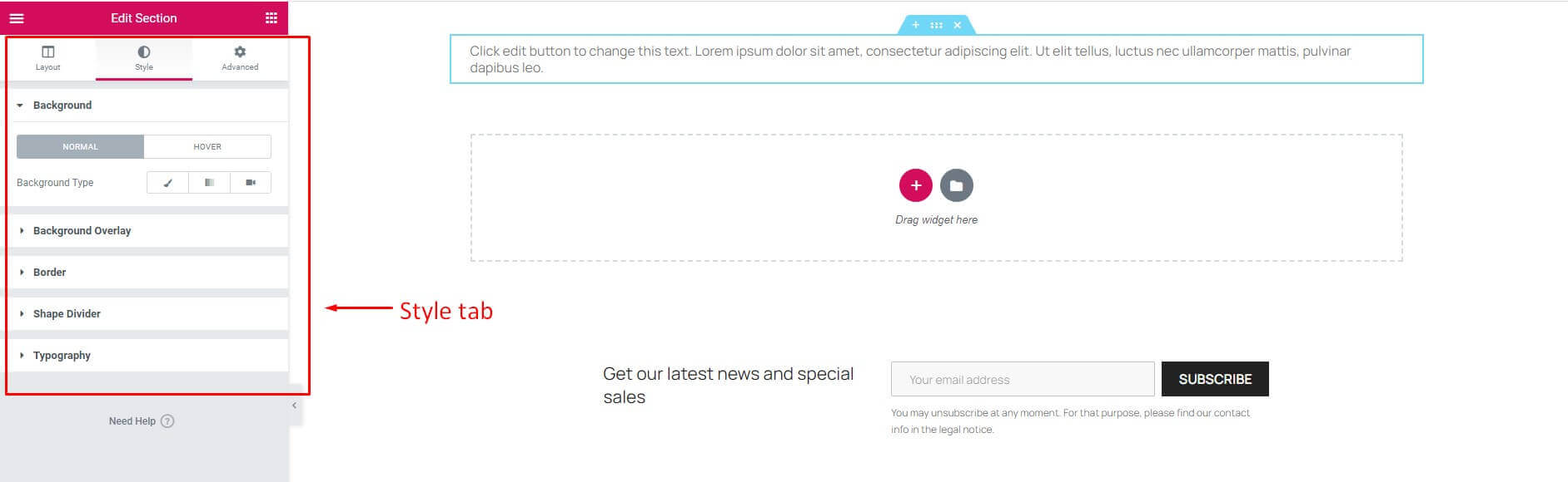
Background
- Background (Normal)
- Background Type: Choose between Classic, Gradient or Video Background.
- Background (Hover)
- Background Type: Choose between Classic or Gradient.
- Transition Duration: Use the slider to set your transition duration or fill in the input box next to it.
Background Overlay
- Background (Normal)
- Background Type: Choose between Classic or Gradient.
- Background (Hover)
- Background Type: Choose between Classic or Gradient.
- CSS Filters: CSS style for background overlay.
- Transition Duration: Use the slider to set your transition duration or fill in the input box next to it.
Border
- Border (Normal & Hover)
- Border Type: Set a Border Type
- Border Radius: Set your Border Radius
- Box Shadow:Add a Box Shadow
Shape Divider
- Shape Divider (Top & Bottom)
- Type: Choose between None, Mountains, Drops, v.v.When not choosing None - Give it a css style.
Typography
Note: The following colors won't work if Default Colors are enabled.
Set the font colors.
Advanced Tab
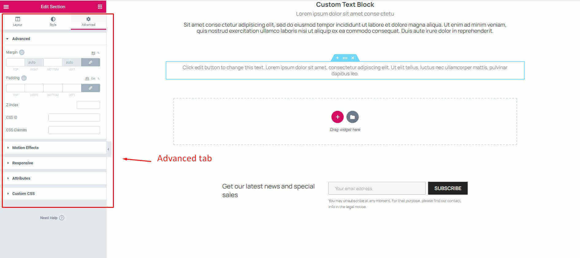
Advanced
- Margin: Control the outer space of the section.
- Padding: Control the inner section spacing. You can set different padding for left, right, top and bottom.
- Z-Index: Set attribute sets the stacking order of a position element.
- CSS ID: Set custom CSS ID for your section.
- CSS Classes: Set custom CSS Classes for your section.
Motion Effects
- Entrance Animation: Click the dropdown to choose an animation.
Responsive
- Reverse Columns: Allows you to switch the order of the columns (Great for Mobile and Tablet)
- Visibility: Show or Hide your section on Desktop, Tablet, or Mobile
Attributes
- Set custom attributes for the wrapper element. Each attribute in a separate line. Separate attribute key from the value using | character.
Custom CSS
- Add your own custom CSS here
Column Overview
Edit Column icons
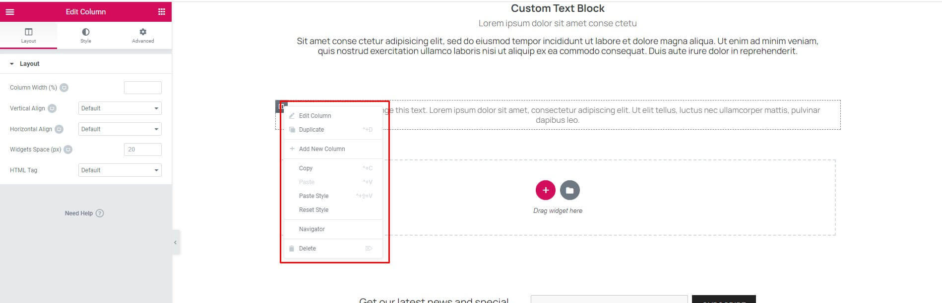
- Drag Column: Move the Section up or down with a simple drag & drop.
- Duplicate: Duplicate the Section with only one click.
- Save: Save the section into your Template Library.
- Remove: Delete Section from page.
Layout Tab
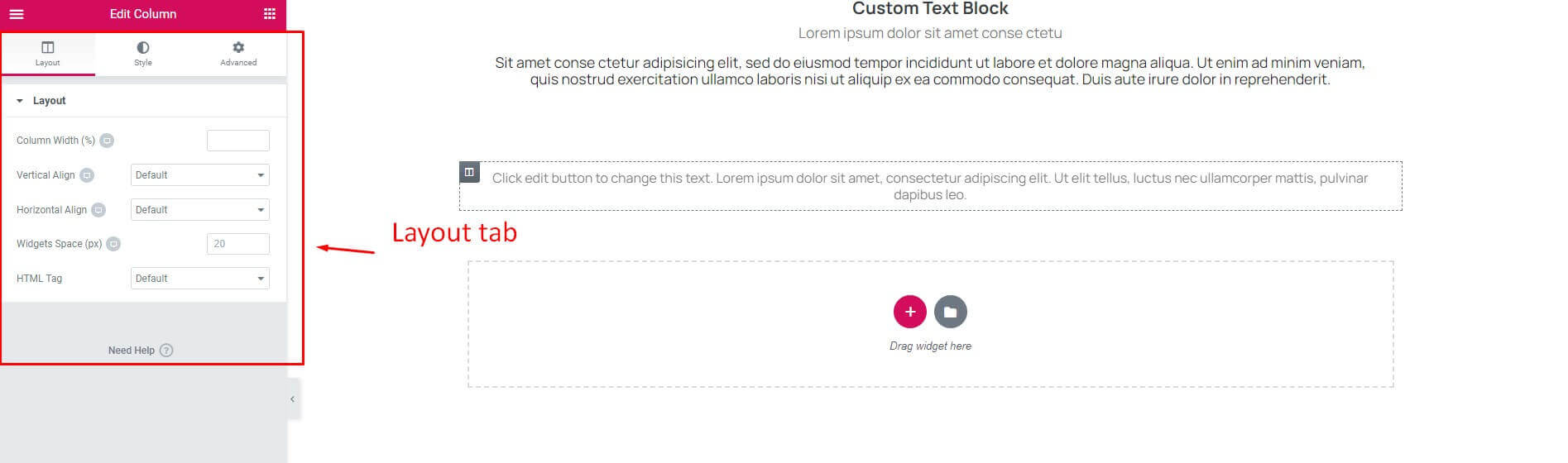
- Column Width (%): Set Column Width (unit is %).
- Vertical Align: Align columns vertically.
- Horizontal Align: Align columns horizontally.
- Widgets Space (px).
- HTML Tag: Choose one from the predefined layouts.
Styles Tab
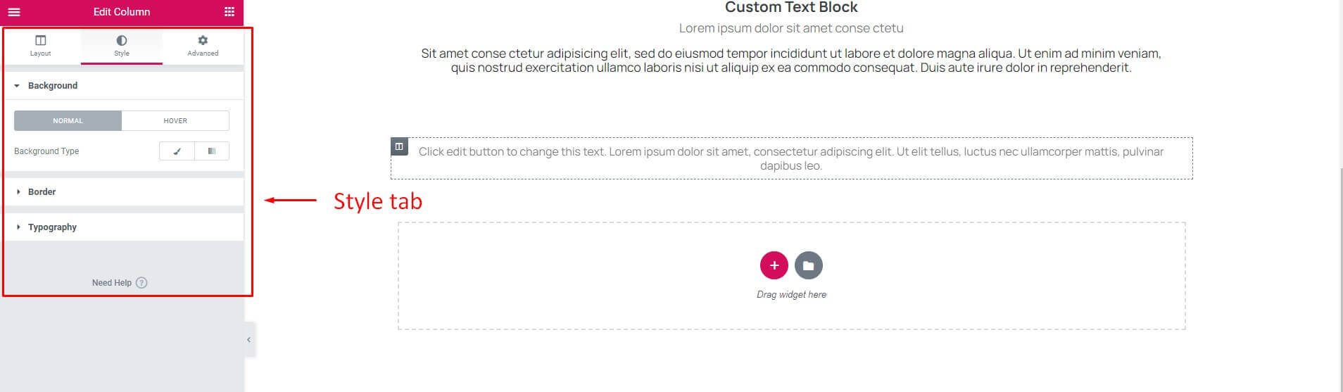
Background
- Background (Normal)
- Background Type: Choose between Classic, Gradient or Video Background.
- Background (Hover)
- Background Type: Choose between Classic or Gradient.
- Transition Duration: Use the slider to set your transition duration or fill in the input box next to it.
Border
- Border (Normal & Hover)
- Border Type: Set a Border Type
- Border Radius: Set your Border Radius
- Box Shadow:Add a Box Shadow
Typography
Note: The following colors won't work if Default Colors are enabled.
Set the font colors.
Advanced Tab

Advanced
- Margin: Control the outer space of the section.
- Padding: Control the inner section spacing. You can set different padding for left, right, top and bottom.
- Z-Index: Set attribute sets the stacking order of a position element.
- CSS ID: Set custom CSS ID for your section.
- CSS Classes: Set custom CSS Classes for your section.
Motion Effects
- Entrance Animation: Click the dropdown to choose an animation.
Responsive
- Reverse Columns: Allows you to switch the order of the columns (Great for Mobile and Tablet)
- Visibility: Show or Hide your section on Desktop, Tablet, or Mobile
Attributes
- Set custom attributes for the wrapper element. Each attribute in a separate line. Separate attribute key from the value using | character.
Custom CSS
- Add your own custom CSS here
Widget Overview
Edit Widget icons

- Drag Column: Move the Section up or down with a simple drag & drop.
- Duplicate: Duplicate the Section with only one click.
- Save: Save the section into your Template Library.
- Remove: Delete Section from page.
Content Tab
Depends on the Widget
Styles Tab
Depends on the Widget
Advanced Tab

Advanced
- Margin: Control the outer space of the section.
- Padding: Control the inner section spacing. You can set different padding for left, right, top and bottom.
- Z-Index: Set attribute sets the stacking order of a position element.
- CSS ID: Set custom CSS ID for your section.
- CSS Classes: Set custom CSS Classes for your section.
Motion Effects
- Entrance Animation: Click the dropdown to choose an animation.
Responsive
- Reverse Columns: Allows you to switch the order of the columns (Great for Mobile and Tablet)
- Visibility: Show or Hide your section on Desktop, Tablet, or Mobile
Attributes
- Set custom attributes for the wrapper element. Each attribute in a separate line. Separate attribute key from the value using | character.
Custom CSS
- Add your own custom CSS here
Widgets
1. Accordion Widget
The Accordion Widget is used to display text in a collapsed, condensed manner, letting you save space while still presenting an abundance of content. With the Accordion, visitors can scan the item titles, and choose to expand an item only if it is of interest. A similar widget is the Toggle Widget, but there are two main differences between the Accordion widget and the Toggle widget:
- When a page is loaded, the first item of the Accordion widget is expanded, while all other items remain collapsed. With the Toggle widget, however, all items are collapsed when a page is first loaded.
- Only one item of an Accordion can be expanded at one time. As you expand another Accordion item, the previously opened item automatically collapses, looking similar to an accordion. With the Toggle widget, however, as many items as desired can be expanded at the same time.

Content Tab
- Accordion Items: Enter a title and content for each accordion item.
- Add Item: Click on the Add Item button to add an accordion item.
- Icon: Select the icon for each accordion item.
- Active Icon: Select the active icon for each accordion item.
- Title HTML Tag: Choose tag for title.
Styles Tab
- Accordion:
- Border Width: Set the thickness of the border around the accordion and between each item.
- Border Color: Choose the color of the border around the accordion and between each item.
- Title:
- Background: Choose the color of the title’s background.
- Color: Choose the color of the non-active titles’ text.
- Active Color: Choose the color of the active title’s text.
- Typography: Set the typography options for the titles.
- Padding: Set the padding for the titles.
- Icon:
- Alignment: Align the icon to the left or right of the title.
- Color: Choose the color of the non-active icon.
- Active Color: Choose the color of the active icon.
- Spacing: Set the distance between the icon and the title.
- Content:
- Background: Choose the background color of the content.
- Color: Choose the text color of the content.
- Typography: Set the typography options for the content.
- Padding: Set the padding for the content.
2. Alert Widget
The Alert Widget allows you to display a colored alert box with many styles to draw the attention of your viewers for different purposes. You can use this element to display dismissable special offers, GDPR and Privacy notifications like the ones you see on this page. It appears each time the customer opens the page.
You can configure enable/disable module

Content Tab
- Type: Choose the type for the alert from Info, Success, Warning, Danger.
- Title & Description Insert the title and description of your Alert widget.
- Dismiss Button: Show or Hide dismiss button (X).
Styles Tab
- Alert:
- Background Color: Set the background color of the alert.
- Border Color: Set the color of the alert border.
- Left Border Width: Set the width of the alert left border.
- Title:
- Text Color: Choose the color of the alert title.
- Typography: Change the typography options for the alert title.
- Description:
- Text Color: Choose the color of the alert description.
- Typography: Change the typography options for the alert description.
3. Block Carousel Widget
The Block Carousel Widget helps you to easily design and customize item.
Content Tab
Block Carousel
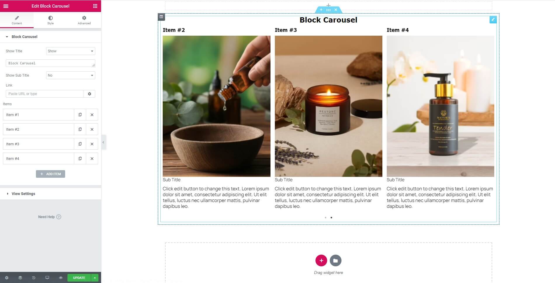
- Show Title: Choose from 2 cases to start your design. Choose from No or Show.
- Show Sub Title: Choose from 2 cases to start your design. Choose from No or Show.
- Link: Set the URL for the link or no.
- Items: The list of items will be displayed here, when editing we edit directly here by clicking on each item.

- Add Item: When we click this button, we will be added a new item.
View Settings
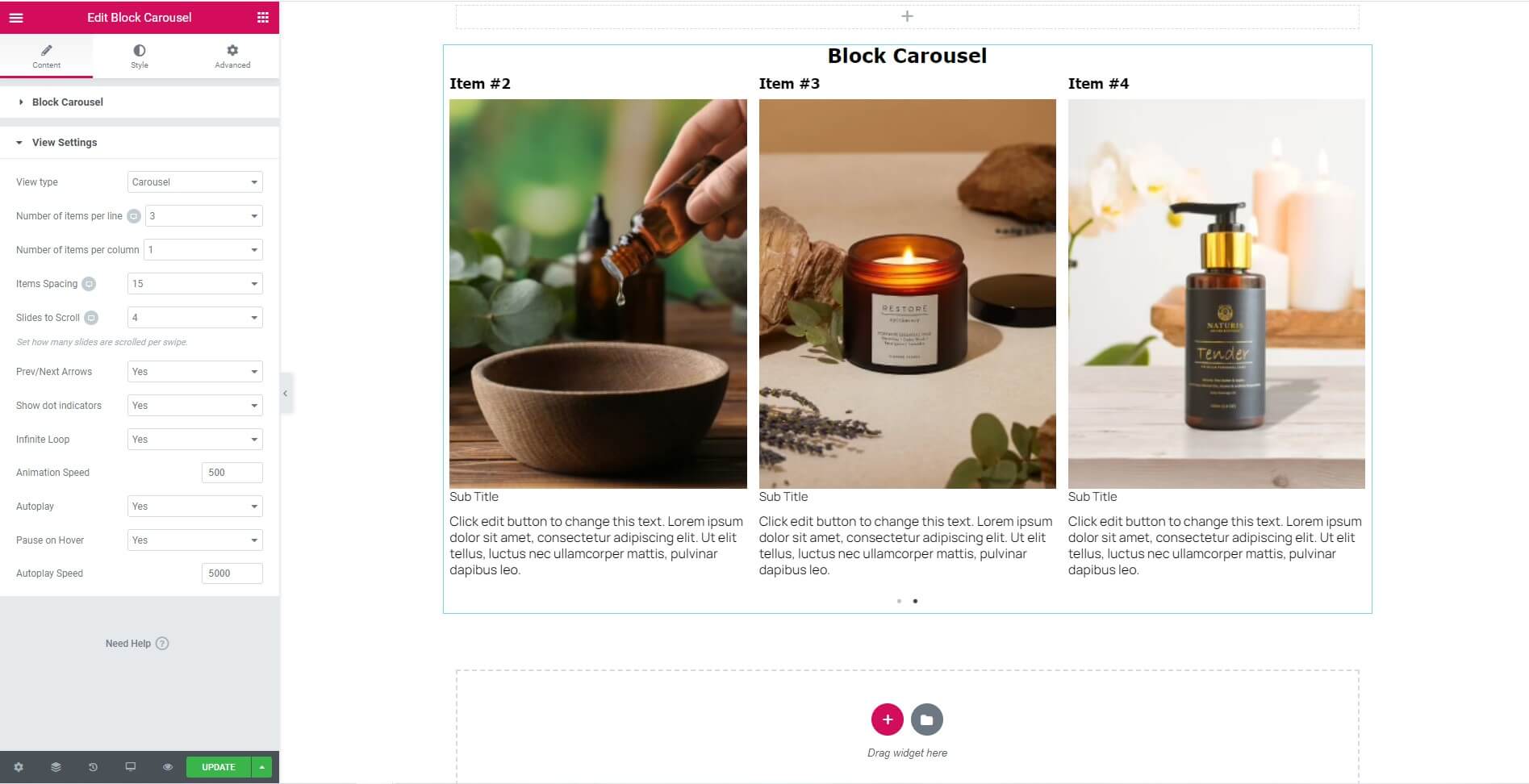
- View type: Type of display. Display on the same row.
- Number of items per line: Choose the number of items per line.
- Number of items per column: Choose the number of items per column. Same with number of line for one page.
- Items Spacing: Choose the distance between the items together.
- Slides to Scroll: Set how many slides are scrolled per swipe.
- Prev/Next Arrows: Display "next" and "prev" buttons. Choose from Yes or No.
- Show dot indicators: Choose from Yes or No.
- Infinite Loop: Items will be run over and over again. Choose from Yes or No.
- Animation Speed: Time to next page.
- Autoplay: Yes - scroll per page. No - scroll per item. This affect next/pre buttons and mouse/touch dragging. Choose from Yes or No.
- Pause on Hover: Stop auto play on mouse hover.
- Autoplay Speed: Time to next page. ( Milliseconds )
Styles Tab
Depends on enabling or disabling attributes
- Alignment: Align the button to the left, center, right, or justified in relation to its column.
- Spacing: Adjust the amount of space.
- Color: Choose the color of the text.
- Typography: Change the typography options.
- Padding: Change the padding settings.
4. Block Link Widget
The Block Link Widget helps you to easily design and customize.

Content Tab
- Show Title: Choose from 2 cases to start your design. Choose from No or Show.
- Show Sub Title: Choose from 2 cases to start your design. Choose from No or Show.
- Link: Set the URL for the link or no.
- Type: Location displayed on the page.
- Toggle: Show or hide matching items.
- Items: The list of items will be displayed here, when editing we edit directly here by clicking on each item.
- Add Item: When we click this button, we will be added a new item.
Styles Tab
Depends on enabling or disabling attributes
- Alignment: Align the button to the left, center, right, or justified in relation to its column.
- Spacing: Adjust the amount of space.
- Color: Choose the color of the text.
- Typography: Change the typography options.
- Padding: Change the padding settings.
5. Button Widget
The Button Widget helps you to easily design and customize buttons.
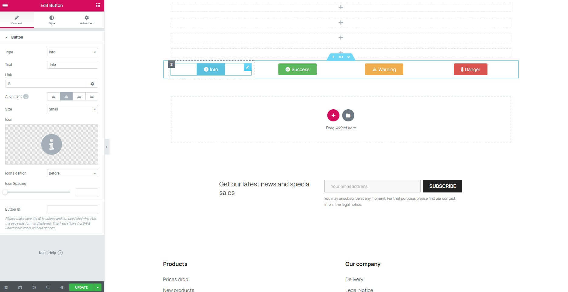
Content Tab
- Type: Select from 5 styles of buttons to begin your design. Choose from Default, Info, Success, Warning, or Danger.
- Text: Enter the button’s text.
- Link: Set the URL for the button’s link. Click the Icon to open in a new window.
- Alignment: Align the button to the left, center, right, or justified in relation to its column.
- Size: Select the preset button sizes, from Extra Small to Extra Large.
- Icon: Select a FontAwesome icon to display on the button.
- Icon Position: Set the icon to appear before or after the button text.
- Icon Spacing: Adjust the amount of space between the icon and the button text.
- Button ID: Please make sure the ID is unique and not used elsewhere on the page this form is displayed. This field allows A-z 0-9 & underscore chars without spaces.
Styles Tab
- Button:
- Typography: Set the background color of the alert.
- Text Shadow: Set the color of the alert border.
- Button(Normal):
- Text Color: Choose the color of the text button.
- Background Color: Choose the color of the button.
- Border Type: Select the type of border to use around the button.
- Border Radius: Set the border radius to control corner roundness.
- Box Shadow: Set a box-shadow to create a drop shadow for the button.
- Padding: Change the padding settings of the button.
- Button(Hover):
- Text Color: Choose the color of the text button.
- Background Color: Choose the color of the button.
- Hover Animation: Click the dropdown to choose an animation when hovering.
- Border Type: Select the type of border to use around the button.
- Border Radius: Set the border radius to control corner roundness.
- Box Shadow: Set a box-shadow to create a drop shadow for the button.
- Padding: Change the padding settings of the button.
6. CountDown Widget
The Countdown widget allows you to count down from the start date to the end date in your page.

Content Tab
- Show Title: Choose from 2 cases to start your design. Choose from No or Show.
- Show Sub Title: Choose from 2 cases to start your design. Choose from No or Show.
- Type: Location displayed on the page.
- Alignment: Align the button to the left, center, right, or justified in relation to its column.
- Time From: Set start time.
- Time To: Set end time.
- Link Label: link label of the countdown.
- Link: Link of the countdown.
- Description: Short description of the countdown.
- Show Day: Choose from 2 cases to start your design. Choose from No or Show.
- Show Hour: Choose from 2 cases to start your design. Choose from No or Show.
- Show Minute: Choose from 2 cases to start your design. Choose from No or Show.
- Show Second: Choose from 2 cases to start your design. Choose from No or Show.
Styles Tab
Depends on enabling or disabling attributes
- Spacing: Adjust the amount of space.
- Color: Choose the color of the text.
- Typography: Change the typography options.
- Padding: Change the padding settings.
7. Counter Widget
The Counter Widget enables you to add an animated numbered counter to your page. When the page is loaded, an animation of running numbers will be seen on this widget, going up from the start point to the end point.

Content Tab
- Starting Number: Set the starting number of the counter.
- Ending Number: Set the ending number of the counter.
- Number Prefix: Enter text to appear before the number, if any, such as a dollar sign.
- Number Suffix: Enter text to appear after the number, if any, such as a plus sign.
- Animation Duration: The time in milliseconds for the running animation to complete.
- Thousand Separator: Separation of counting units.
- Separator: Choose from 3 cases to start your design. Choose from Default, Dot or Space.
- Title: Type the title that will appear below the number.
Styles Tab
Depends on enabling or disabling attributes
- Spacing: Adjust the amount of space.
- Color: Choose the color of the text.
- Typography: Change the typography options.
- Padding: Change the padding settings.
8. Divider Widget
This widget allows you to add horizontal lines that divide your content. This is a fairly basic and simple widget, but it can help you create nice effects as separators of various sections, or for highlights of your headings.

Content Tab
- Style: Choose between solid, double, dotted or dashed styles.
- Weight: Control the thickness of the divider.
- Color: Choose the color of the divider.
- Width: Control the width of the divider as percentage from 0 to 100 percent.
- Alignment: Align the divider to the left, center or right of the page.
- Gap: Control the space above and below the divider.
9. Generate Code Widget
This widget allows you to add code snippet. The code will be read and the result will be displayed on the screen.

Content Tab
- Generate Code TPL: Enter the code into the textarea, the results will be displayed on the screen.
10. Google Maps Widget
The Google Maps widget is a really simple way to embed Google Maps in your website. This is very useful for contact pages, so your visitors can know where you are situated.

Content Tab
- Address: Enter the location you wish to display
- Zoom Level: Set the zoom level of the map
- Height: Set the height of the map in pixels
11. Heading Widget
The Heading Widget allows you to create stylish title headings.

Content Tab
- Title: Type your heading text.
- Link: Link the heading to a URL.
- Size: Change the heading to Small, Medium, Large, XL or XXL.
- HTML tag: Set the heading’s HTML tag to H1- H6, Div, Span or P.
- Alignment: Align the heading to the left, right, center, or justified.
Style Tab
- Text color: Choose the color of the heading text.
- Typography: Change the typography options for the heading text.
- Text Shadow: Change the text-shadow options for the heading text.
- Blend Mode: Choose the blend mode of the heading text.
12. HTML Widget
Inside the HTML Widget you can embed HTML, CSS, and also include JS scripts. It’s mostly recommanded for advanced users.

Content Tab
- HTML Code: Type your text in input Textarea.
Style Tab
Depends on the type of attribute entered.
13. Icon Widget
The Icon widget is incredibly useful for displaying icons in numerous styles on your page. You can choose to display the icon as default, stacked, or framed. The list of icons is derived from the Font Awesome, My Libraries set, you can upload your icon and we try to keep it as updated as possible.

Content Tab
- Icon: Choose an icon from an icon library.
- View: Choose between default, stacked or framed.
- Shape: Choose between circle or square.
- Link: Set the icon to link to a URL, and choose if the link opens in the same window or in a new window.
- Alignment: Align the icon to the left, right, or center.
Style Tab
Icon(Normal & Hover)
- Primary Color: Choose the main and secondary colors for the icon. Note that if you choose stacked or framed icon box, you will also have a secondary color.
- Size: Increase or decrease the size of the icon.
- Padding: Change the padding settings.
- Rotate: Rotate the icon.
- Border Width: Set the thickness of the border around the icon and between each item.
- Border Radius: Set the border radius to control corner roundness.
Icon(Hover)
- Hover Animation: Click the dropdown to set any animation for the hover state.
The stacked and framed icon setting also has the shape option to choose from circle or square. It also features the icon padding, allowing you to add inner padding to the icon. You also get the border radius, which lets you control the round edges of the frame.
14. Icon Box Widget
Icon boxes come in very handy when building websites. The most common usage is for sections that list features of products or services. The icons are derived from the Font Awesome Icons, My Libraries set, you can upload your icon, and you are able to search through them and pick the right one.
Content Tab
- Icon: Choose an icon from an icon library.
- View: Set the view of the icon as 'Default', 'Stacked' or 'Framed'. Stacked is with a background and framed is with a frame surrounding the icons.
- Title & Description: Insert the title and description of your Icon Box widget.
- Link: Set the icon to link to a URL, and choose if the link opens in the same window or in a new window.
- Icon Position: Set the position of the icon on the left, top or right side of the box.
- Title HTML Tag: Choose the title tag, from H1..H6, Div, Span or P.
Style Tab
Icon(Normal & Hover)
- Primary Color: Choose the main and secondary colors for the icon. Note that if you choose stacked or framed icon box, you will also have a secondary color.
- Spacing: The space between the icon and the heading.
- Size: Increase or decrease the size of the icon.
- Rotate: Rotate the icon.
Icon(Hover)
- Hover Animation: Click the dropdown to set any animation for the hover state.
Content
- Alignment: Left, centers, right or justified.
- Vertical Alignment: Top, middle and bottom.
Content > Title
- Spacing: Set the spacing between the title and the description.
- Color: Change the color of the title.
- Typography: Here I can customize the typography of the title.
Content > Description
- Color: Change the color of the description.
- Typography: Here I can customize the typography of the description.
15. Icon List Widget
The Icon List Widget creates an easy-to-manage list of items, with each item highlighted by its own icon.
Content Tab
Icon List
- Layout: Present items vertically or horizontally.
Icon List > Items
- Text: Enter the list item’s text.
- Icon: Select the icon for the item.
- Link: Enter the URL for the item’s link.
Add Item: Click on the Add Item button to add an item.
Style Tab
List
- Space Between: Distance between items.
- Alignment: Align the Item to the left, right or center.
- Divider: Set the length of the separator between items when enabled
Icon
- Color: Choose the icon’s color.
- Hover: Choose the icon’s color for the hover state.
- Size: Set the exact size of the icon.
- Alignment: Align the Icon to the left, right or center.
Text
- Text Color: Choose the color of the text.
- Hover: Choose the text color for the hover state.
- Text Indent: Set the distance between the icon and the text.
- Typography: Set the typography options for the text.
16. Image Widget
The Image widget lets you add images to your pages, and design them visually using Creative Elements. Images play a vital role in web design, so you will most likely use the Image Widget a lot while designing your website. When you add the image widget to the page, the left panel opens the settings panel for that widget. This panel includes the content, style and advanced tab for the image widget. Let's go over all of the settings you can control for this widget.

Content Tab
- Choose Image: This is where you choose your image. Click on the frame and the Image Manager will pop up, letting you choose an existing image, or upload a new image.
- Alignment: Align the image to the left, right or center of the Column.
- Caption: Choose none if you don't want to add caption and choose the other case if you want to add caption. Add caption to the bottom of the image.
- Link: Set a link to a URL, media file or have it stay with no link
Style Tab
- Width: This is a scale control of the image. Depends on the unit.
- Max Width (%): This is a scale control of the image. Scale it from 0-100 percent.
- Opacity: Choose the opacity of the image, making it more transparent.
- Hover animation: Choose a hover animation, so when the mouse hovers over the image the animation will start
- Border type: Choose from none, solid, double, dotted or dashed
- Border radius: Make the edges of the image rounder, or make the whole image a round
- Box shadow: Add the box shadow effect to the image, and set the blur, spread, horizontal and vertical settings of the box shadow
- Caption: Depends on the selected attribute type.
17. Image Box Widget
The Image Box widget lets you add image boxes that combines images, headlines and text. This is used, mostly and alternatively to the Icon Box Widget, for features sections. You have full control over the design of the image, the headline and the description.

Content Tab
- Choose Image: This is where you choose your image. Click on the frame and the Image Manager will pop up, letting you choose an existing image, or upload a new image.
- Title & Description: Insert the title and description of your Image Box widget.
- Link: Add the URL the box will link to.
- Image Position: Set the position of the image to left, top or right, relative to the title and description.
- Title HTML Tag: Choose the title tag, from H1..H6, Div, Span or P.
Style Tab
Image
- Spacing: The space between the image and the title.
- Width (%): This is a scale control of the image. Scale it from 0-100 percent.
- Hover Animation: Choose a hover animation, so when the mouse hovers over the image the animation will start
- CSS Filters: CSS style for image.
- Opacity: Control the opacity of the image. Choose the opacity of the image, making it more transparent.
- Transition Duration: Make the edges of the image rounder, or make the whole image a round
Content
- Alignment: Align the image to the left, right, center, or justified of the Column.
- Vertical Alignment: Align vertically, there are three options: top, middle, and bottom.
Content > Title
- Spacing: The space between the title and the description.
- Color: Choose the title color.
- Typography: Set the typography options for the title.
Content > Description
- Color: Choose the description color.
- Typography: Set the typography options for the description.
- Padding: Control the inner section spacing. You can set different padding for left, right, top and bottom.
- Position: Set the position of the text.
18. Inner Section Widget
Inner Section Widget utility helps to create a child Section inside a parent Section. The Inner Section is located inside a column of the parent Section. We cannot put an Inner Section inside the created Inner Section unless you use Shortcode.

Layout Tab
Layout
- Content Width: Set the Content Width to Boxed or Full Width. When choosing Boxed - use the slider to set your width.
- Columns Gap: Set your Columns Gap.
- Height: Choose between Fit to Screen: Your section will fill the screen, and Min Height: Set a Min Height, and use the slider to set your section height.
- Content Position: Set your Section Content Position.
- Overflow: Set the Overflow to Default or Hidden.
- HTML Tag: Choose one from the predefined layouts.
Layout > Structure
Choose one from the predefined layouts.
Layout > More Structures
Choose one from many predefined layouts.
Background
- Background (Normal)
- Background Type: Choose between Classic, Gradient or Video Background.
- Background (Hover)
- Background Type: Choose between Classic or Gradient.
- Transition Duration: Use the slider to set your transition duration or fill in the input box next to it.
Background Overlay
- Background (Normal)
- Background Type: Choose between Classic or Gradient.
- Background (Hover)
- Background Type: Choose between Classic or Gradient.
- CSS Filters: CSS style for background overlay.
- Transition Duration: Use the slider to set your transition duration or fill in the input box next to it.
Border
- Border (Normal & Hover)
- Border Type: Set a Border Type
- Border Radius: Set your Border Radius
- Box Shadow:Add a Box Shadow
Shape Divider
- Shape Divider (Top & Bottom)
- Type: Choose between None, Mountains, Drops, v.v.When not choosing None - Give it a css style.
Typography
Note: The following colors won't work if Default Colors are enabled.
Set the font colors.
19. Instagram Widget
Instagram widget Allows you to add an Access Token to display instagram photos related to your topic.
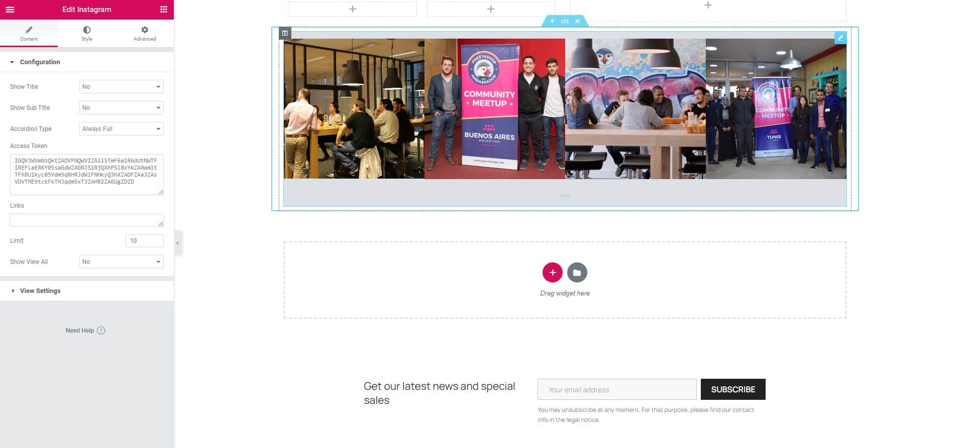
Content Tab
Configuration
- Show Title: Choose from 2 cases to start your design. Choose from No or Show.
- Show Sub Title: Choose from 2 cases to start your design. Choose from No or Show.
- Accordion Type: Choose from 3 cases to start your design.
- Access Token: Enter the photo access link in the card.
- Links: Wrap the images with a link to the photo on instagram. Set empty to use link of instagram image.
- Limit: Number of Images want to get. Max is 20 images, this is rule of Instagram.
- Show View All: Choose from 2 cases to start your design. Choose from No or Show.
View Settings
- View type: Type of display. Display on the same row.
- Number of items per line: Choose the number of items per line.
- Number of items per column: Number of item per one column. Same with number of line for one page.
- Items Spacing: Choose the distance between the items together.
- Slides to Scroll: Set how many slides are scrolled per swipe.
- Prev/Next Arrows: Display "next" and "prev" buttons. Choose from Yes or No.
- Show dot indicators: Choose from Yes or No.
- Infinite Loop: Items will be run over and over again. Choose from Yes or No.
- Animation Speed: Time to next image.
- Autoplay: Yes - scroll per image. No - scroll per image. This affect next/pre buttons and mouse/touch dragging. Choose from Yes or No.
- Pause on Hover: Stop auto play on mouse hover.
- Autoplay Speed: Time to next image. ( Milliseconds )
20. Manufacturers Carousel Widget
This widget will show you the logos of all the manufacturers, or those that you need to display.

Content Tab
Manufacturers Carousel
- Show Title: Choose from 2 cases to start your design. Choose from No or Show.
- Show Sub Title: Choose from 2 cases to start your design. Choose from No or Show.
- Source: Choose from 2 cases to start your design. Choose from All manufacturers, or Select manufacturers.
- Image: Choose from 3 cases to start your design. Choose from large_default, medium_default or small_default.
- Order by: Set ordering by id, name, date add, date update.
- Order way: Select the ordering direction to ascending or descending.
- Limit: Number of Images want to get.
View Settings
- View type: Type of display. Display on the same row.
- Number of items per line: Choose the number of items per line.
- Number of items per column: Number of item per one column. Same with number of line for one page.
- Items Spacing: Choose the distance between the items together.
- Slides to Scroll: Set how many slides are scrolled per swipe.
- Prev/Next Arrows: Display "next" and "prev" buttons. Choose from Yes or No.
- Show dot indicators: Choose from Yes or No.
- Infinite Loop: Items will be run over and over again. Choose from Yes or No.
- Animation Speed: Time to next image.
- Autoplay: Yes - scroll per image. No - scroll per image. This affect next/pre buttons and mouse/touch dragging. Choose from Yes or No.
- Pause on Hover: Stop auto play on mouse hover.
- Autoplay Speed: Time to next image. ( Milliseconds )
21. Menu Anchor Widget
The Menu Anchor widget allows you to create a page with an internal smooth scrolling navigation.
Content Tab
Anchor
- The ID of Menu Anchor: This ID will be the CSS ID you will have to use in your own page, without #.
22. Module Widget
Select a module from the list what you want to display on this Widget. (Only those modules are available which implements the WidgetInterface class).

Content Tab
Module Options
- Module: Select the module to display.
23. Products( Carousel / Grid )
Showcase your products to your buyers in a fancy carousel! This widget will help you to increase sales by highlighting your featured products, new products, prices drop and bestsellers.

Content Tab
Product Options
- Show Title: Choose from 2 cases to start your design. Choose from No or Show.
- Show Sub Title: Choose from 2 cases to start your design. Choose from No or Show.
- Source of products: Choose product list from featured products, prices drop, new products, best products, or custom products by ID.
- Product Limit: Enter the photo access link in the card.
- Order by: Set ordering by product id, price, published date, product name, position, or manufacturer.
- Order: Select the ordering direction to ascending or descending.
- Template: Allows you to use the Product item option configured in Product Lists Builder.
View Settings
- View type: Type of display. Display on the same row.
- Number of items per line: Choose the number of items per line.
- Number of items per column: Number of item per one column. Same with number of line for one page.
- Items Spacing: Choose the distance between the items together.
- Slides to Scroll: Set how many slides are scrolled per swipe.
- Prev/Next Arrows: Display "next" and "prev" buttons. Choose from Yes or No.
- Show dot indicators: Choose from Yes or No.
- Infinite Loop: Items will be run over and over again. Choose from Yes or No.
- Animation Speed: Time to next item.
- Autoplay: Yes - scroll per item. No - scroll per item. This affect next/pre buttons and mouse/touch dragging. Choose from Yes or No.
- Pause on Hover: Stop auto play on mouse hover.
- Autoplay Speed: Time to next image. ( Milliseconds )
24. Products Tabs( Carousel / Grid )
Showcase your products to buyers on a fancy carousel! This widget will allow you to display many featured products.

Content Tab
Product Tabs
Tabs Items:
- Title: Enter a title for each tab.
- Source of products: Choose product list from featured products, prices drop, new products, best products, or custom products by ID.
- Product Limit: Enter the photo access link in the card.
- Order by: Set ordering by product id, price, published date, product name, position, or manufacturer.
- Order Direction: Select the ordering direction to ascending or descending.
- Template: Allows you to use the Product item option configured in Product Lists Builder.
Button "Add item": When we click this button, we will be added a new item.
View Settings
- View type: Type of display. Display on the same row.
- Number of items per line: Choose the number of items per line.
- Number of items per column: Number of item per one column. Same with number of line for one page.
- Items Spacing: Choose the distance between the items together.
- Slides to Scroll: Set how many slides are scrolled per swipe.
- Prev/Next Arrows: Display "next" and "prev" buttons. Choose from Yes or No.
- Show dot indicators: Choose from Yes or No.
- Infinite Loop: Items will be run over and over again. Choose from Yes or No.
- Animation Speed: Time to next item.
- Autoplay: Yes - scroll per item. No - scroll per item. This affect next/pre buttons and mouse/touch dragging. Choose from Yes or No.
- Pause on Hover: Stop auto play on mouse hover.
- Autoplay Speed: Time to next image. ( Milliseconds )
Style Tab
Tabs
- Alignment: Align the image to the left, right, center, or justified of the Column.
- Border Type: Select the type of border to use around the tab.
- Border Radius: Set the border radius to control corner roundness.
- Box Shadow: Set a box-shadow to create a drop shadow for the tab.
- Background Color: Choose background color for tab.
- Padding: Control the inner section spacing. You can set different padding for left, right, top and bottom.
- Margin: Control the outer space of the section. You can set different padding for left, right, top and bottom.
Title
- Alignment: Align the image to the left, right, or center of the Column.
- Spacing: The space between the title and the content.
- Color: Choose the title color.
- Typography: Set the typography options for the title.
- Padding: Control the inner section spacing. You can set different padding for left, right, top and bottom.
- Active Color: Choose the title active color.
25. Progress Bar Widget
This Widget allows you to add fully styled, animated progress bars to your page. Progress bars are usually great to engage users for fundraising campaigns or showing off a milestone your business achieved.

Content Tab
- Title: Enter the title text that is displayed above the progress bar.
- Type: Select a standard type, which sets the bar color (color can be changed under the Style tab). Choose from Default, Info, Success, Warning, or Danger.
- Percentage: Set the completion percentage number.
- Display Percentage: Show or hide the actual percentage number text at the end of the bar.
- Inner Text: Enter the text to be displayed within the bar.
Style Tab
Progress Bar
- Color: Change the color of the bar.
- Background Color: Choose the color of the background of the bar.
- Height: Choose the height of the bar.
- Border Radius: Set the border radius to control corner roundness.
Progress Bar > Inner Text
- Color: Choose the color of the text to be displayed within the bar.
- Typography: Set the typography options for the text.
Title Style
- Text Color: Choose the color of the title text that is displayed above the progress bar.
- Typography: Set the typography options for the title text.
26. Social Icons Widget
The Social Icons Widget lets you add icon links to all your social media profiles. With this Widget you get total control over the appearance of your social icons.
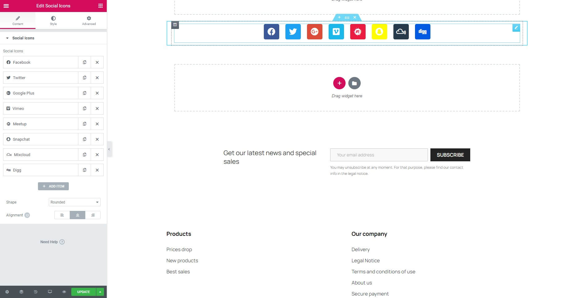
Content Tab
- Social Icons: Click the button "Add item" to add a Social network icon.
- Shape: Choose an Icon Shape from Rounded, Square or Circle.
- Alignment: Set the Icons Alignment.
Style Tab
Icon
- Color: Change the color of the bar.
- Size: Increase or decrease the size of the icon.
- Padding: Control the inner section spacing. You can set different padding for left, right, top and bottom.
- Spacing: Set the distance between the icons.
- Border Type: Select the type of border to use around the icon.
- Border Radius: Set the border radius to control corner roundness.
Icon Hover
- Hover Animation: Click the dropdown to choose an animation when hovering.
27. Spacer Widget
It’s the easiest widget, use it if you want to put some space inside a Column.
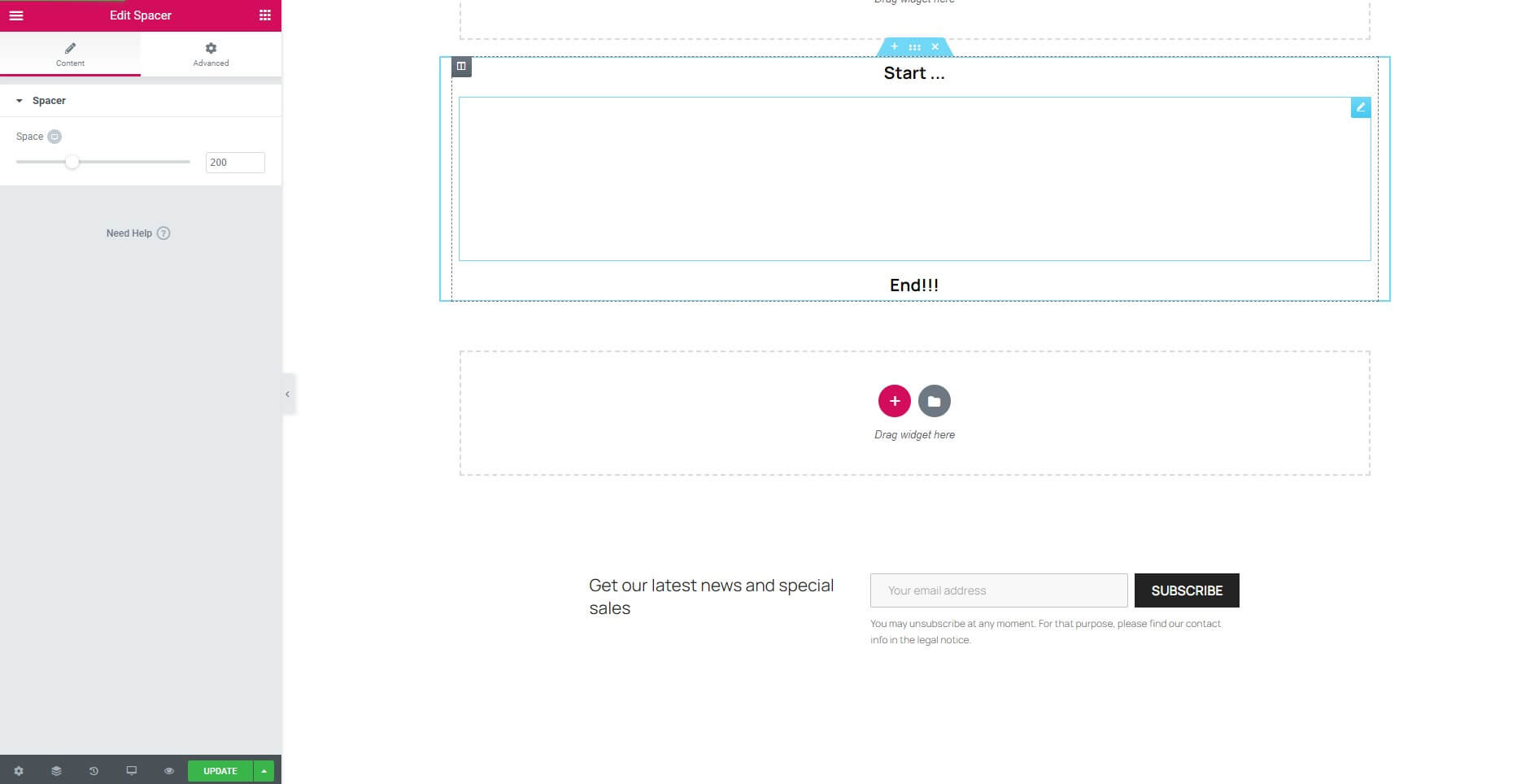
Content Tab
- Space: Increase or decrease the space using the slider.
28. Star Rating Widget
It’s the easiest widget, use it if you want to put some space inside a Column.
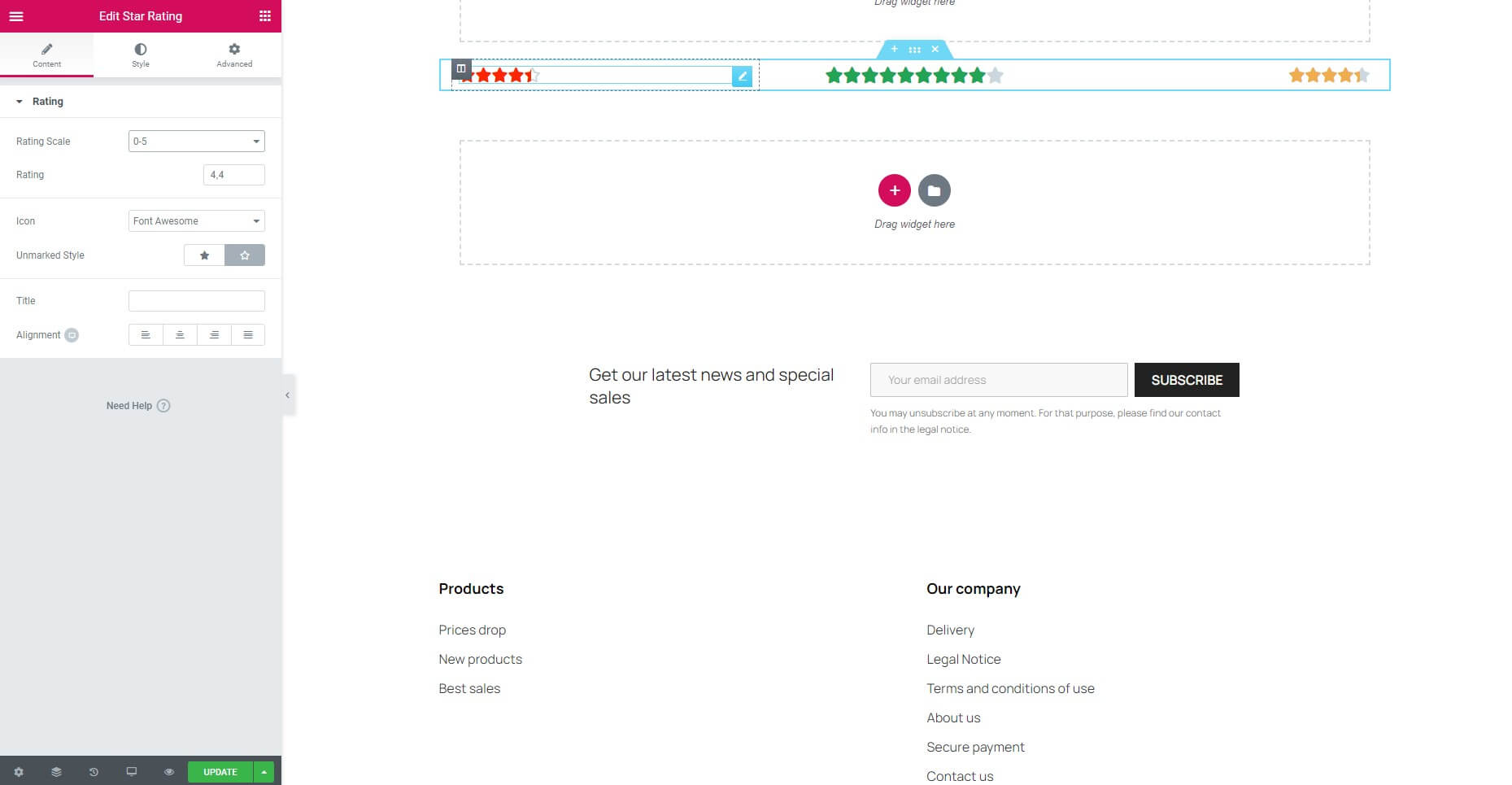
Content Tab
- Rating Scale: There are two rating scales from 0-5 and 0-10, depending on your choice.
- Rating: Your rating here.
- Icon: Select library for the icon.
- Unmarked Style: Increase or decrease the space using the slider.
- Title: Enter a title for the icon.
- Alignment: Align the icon to the left, center, right, or justified in relation to its column.
Style Tab
- Size: Increase or decrease the size of the icon.
- Spacing: Set the distance between the icons.
- Color: Change the color of the icon.
- Unmarked Color: Change the color of the unmarked.
29. Tabs Widget
The Tabs Widget allows you to divide your content into tabs.

Content Tab
- Tabs Items: Enter a title and content for each tab.
- Add Item: Click on the Add Item button to add another tab.
- Type: Select a standard type. Choose from Horizontal, Vertical.
Style Tab
Tabs
- Border Width: Set the thickness of the border around the tab.
- Border Color: Set the color of the tab border.
- Background Color: Choose the color of the background of the tab.
Tabs > Title
- Color: Change the color of the title.
- Active Color: Change the active color of the title.
- Typography: Set the typography options for the title text.
Tabs > Content
- Color: Change the color of the content text.
- Typography: Set the typography options for the text.
30. Testimonial Widget
This is a great Widget for promoting your services or products and adding social proof of the value you provide your customers.
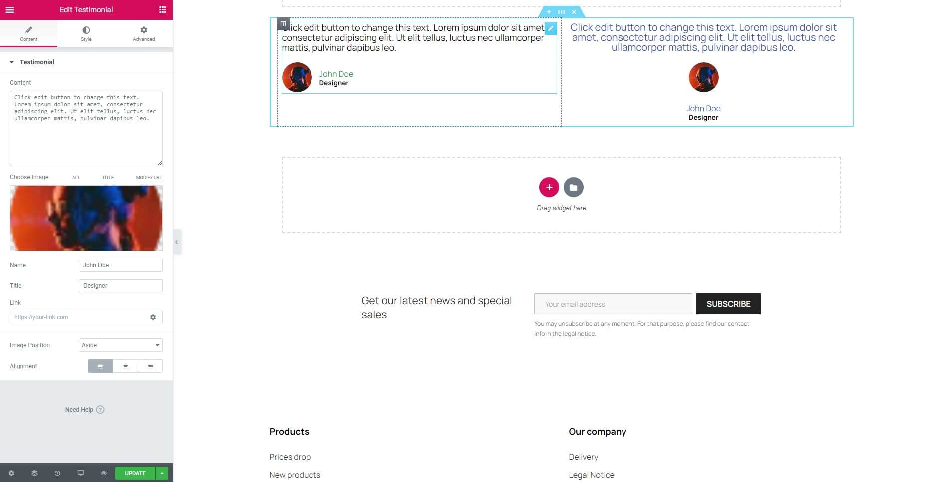
Content Tab
Testimonial
- Content: Enter the text of the testimonial.
- Choose Image: Upload the testimonial author’s image.
- Name: Enter the testimonial author’s name.
- Title: Enter the testimonial author’s job title.
- Link: Add the URL the box will link to or set empty if you do not use.
- Image Positon: Set the image position, relative to the testimonial content. Options include: Aside or Top.
- Alignment: Align the testimonial to the left, right, or center.
Style Tab
Content
- Color: Change the color of the content text.
- Typography: Set the typography options for the content text.
Image
- Image Size: Change the size of the image.
- Border Type: Select the type of border to use around the image.
- Border Radius: Set the border radius to control corner roundness.
Name
- Color: Change the color of the name text.
- Typography: Set the typography options for the name text.
Title
- Color: Change the color of the title text.
- Typography: Set the typography options for the title text.
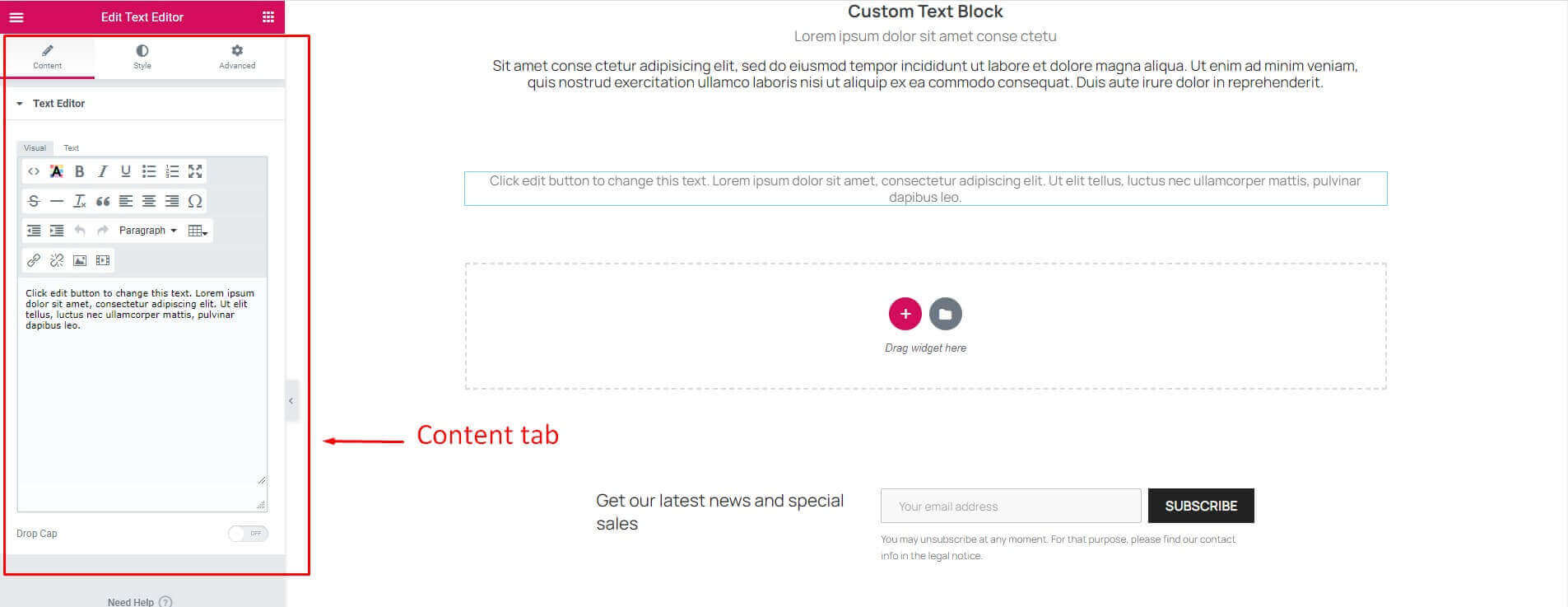
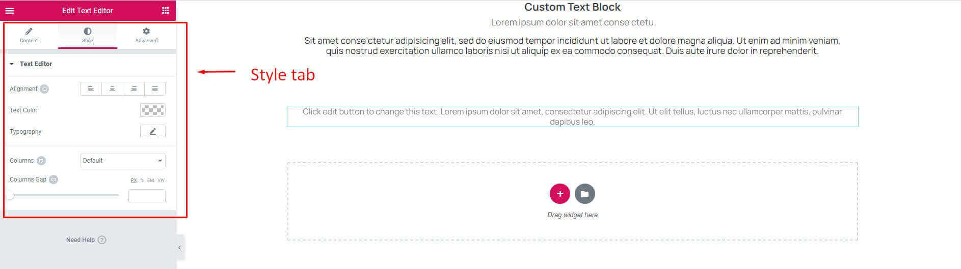
31. Text Editor Widget
This widget is great to add content to your page. If you need to add shorter text, you might prefer to use the Heading widget. This widget has more styling options that let you change settings like font weight, line height, letter spacing, alignment, and more.

Content Tab
Text Editor
- Text Editor is a TinyMCE WYSIWYG editor that behaves just like the classic PrestaShop visual editor. You can enter rich text, images and more.
- Drop Cap: Drop cap on or off.
Style Tab
Text Editor
- Alignment: Align the text to the left, right, center, or justified.
- Text color: Choose the color of the text.
- Typography: Change the typography options for the text.
- Columns: Split text into multiple columns.
- Columns Gap: Increase the distance between the columns divided above.
Drop Cap
- View: Change the size of the image.
- Primary Color: Choose the main for the drop cap.
- Space: Distance of drop cap to text content.
- Border Radius: Set the border radius to control corner roundness.
- Typography: Change the typography options for the text.
32. Toggle Widget
The Toggle Widget lets you create text boxes that are collapsed, so the visitor only sees the titles of each text box item. This lets you show your content in a condensed form, so visitors don't have to scroll through a long page and can sift through the titles easily. A similar widget is the Accordion widget, but there are two main differences between the Toggle widget and the Accordion widget.
- When a page is loaded, all Toggle widget items are collapsed. With the Accordion widget, however, the first item is expanded, while all other items remain collapsed.
- With the Toggle widget, as many items as desired can be expanded at the same time. With the Accordion widget, however, only one item can be expanded at one time. As you expand another Accordion item, the previously opened item automatically collapses, looking similar to an accordion.
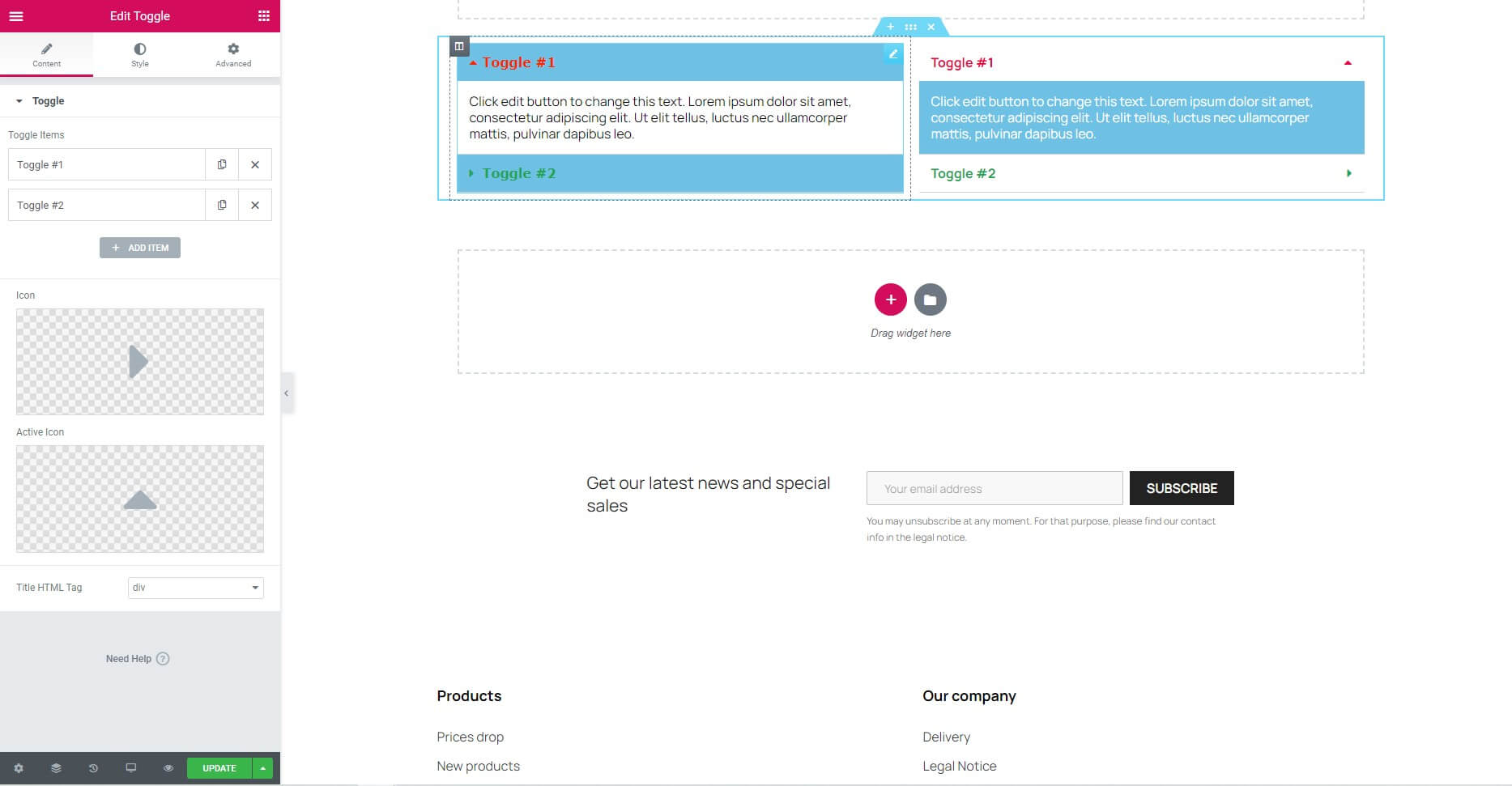
Content Tab
- Toggle Items: Enter a title and content for each toggle item.
- Add Item: Click on the Add Item button to add an toggle item.
- Icon: Choose an icon from an icon library.
- Active Icon: Choose an active icon from the library.
- Title HTML Tag: Choose the title tag, from H1..H6, or Div.
Style Tab
Toggle
- Border Width: Set the thickness of the border around the toggle and between each item.
- Border Color: Set the color of the toggle border.
- Space Between: Distance between items.
- Box Shadow: Split text into multiple columns.
Title
- Background: Choose the color of the background of the title.
- Color: Choose the color of the title text.
- Active Color: Choose the active color of the title text.
- Typography: Change the typography options for the text.
- Padding: Control the inner section spacing. You can set different padding for left, right, top and bottom.
Icon
- Alignment: Align the icon to the left, or right.
- Color: Choose the color of the icon.
- Active Color: Choose the active color of the icon.
- Spacing: Set the distance between the icon and the title.
Content
- Background: Choose the color of the background of the content.
- Color: Choose the color of the content text.
- Typography: Change the typography options for the content text.
- Padding: Control the inner section spacing. You can set different padding for left, right, top and bottom.
33. Video Widget
Use the Video Widget to easily embed videos on your page.

Content Tab
Video
- Source: Select the source of the video Choose between YouTube, Vimeo, or Dailymotion.
- Link: Enter the URL of the video.
- Start Time: Specify a start time (in seconds).
- End Time: Specify an end time (in seconds).
Video Options > YouTube
- Autoplay: Set to Yes to automatically play the video on page load.
- Mute: Show or Hide mute the videos.
- Loop: Set to Yes to Loop the video.
- Player Controls: Show or Hide the Player Controls, such as Play/Pause, Volume, etc.
- Modest Branding: Show or Hide Modest Branding the Video Info.
- Privacy Mode: When you turn on privacy mode, YouTube won't store information about visitors on your website unless they play the video.
Video Options > Vimeo
- Autoplay: Set to Yes to automatically play the video on page load.
- Mute: Show or Hide mute the videos.
- Loop: Set to Yes to Loop the video.
- Controls Color: Choose the color of the Player Controls, such as Play/Pause, etc.
- Intro Title: Show or Hide the Video Intro Title.
- Intro Portrait: Show or Hide the Video Intro Portrait.
- Intro Byline: Show or Hide the Video Intro Byline.
Video Options > Dailymotion
- Autoplay: Set to Yes to automatically play the video on page load.
- Mute: Show or Hide mute the videos.
- Player Controls: Show or Hide the Player Controls, such as Play/Pause, Volume, etc.
- Video Info: Show or Hide video info of the videos.
- Logo: Show or Hide logo of the videos.
- Controls Color: Choose the color of the Player Controls, such as Play/Pause, etc.
Image Overlay
- Image Overlay: Show or Hide an Image Overlay.
Style Tab
Video
- Aspect Ratio: Change the videos aspect ratio (default 16:9).
- CSS Filters: CSS style for video.
Modules
34. Leo Blog Module
Leo Blog is a module Blog for Prestashop that includes everything for your site blog page. The Blog dashboard allows you to configure how the display of the blog page, listing item view, and item detail view. You can also create a theme, and template for the blog page. Blog content management includes Category management, blog item management, and comment management.
Download and Install
Leo Blog has been realeased, after buying this module you can download it at our official site or at other market as Prestashop Addon, Themeforest. In addition, Leo Blog is integrated in our prestashop themes. So you can buy our themes and experience the powerful Leo Blog Module.
You can install our modules as other modules extremely easily and quickly. After you buy the module and installation, we will quick support if there are problems. Also we integrate the features installed demo data so you can quickly build sites. With powerful features but installation process is quite fast and easy. If you have to face with any problems please contact us. We will always beside you.
Install the module from Back Office
- In the Modules tab, click on Upload a module
- Browse to open the dialogue box letting you search your computer and select the file or just drop your module to the upload area.
- Once the installation is successful, the following message will appear:
- The module is successfully installed, now click on the Configure button to setup the module.
- Or you can access the module manager tab, then search for Leo Blog, enable it then open its setting panel.

How to use
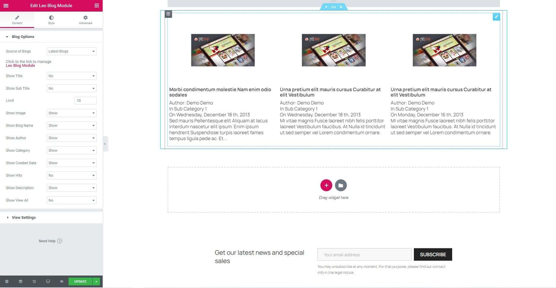
Content Tab
Blog Options
- Source of Blogs: Select the source of the blog.
- Show Title: Choose from 2 cases to start your design. Choose from No or Show.
- Show Sub Title: Choose from 2 cases to start your design. Choose from No or Show.
- Limit: Number of Images want to get.
- Show Image: Show or Hide Image.
- Show Blog Name: Show or Hide Blog Name.
- Show Author: Show or Hide Author.
- Show Category: Show or Hide Category.
- Show Created Date: Show or Hide Created Date.
- Show Hits: Show or Hide Hits.
- Show Description: Show or Hide Description.
- Show View All: Show or Hide View All.
View Settings
- View type: Type of display. Display on the same row.
- Number of items per line: Choose the number of items per line.
- Number of items per column: Choose the number of items per column. Same with number of line for one page.
- Items Spacing: Choose the distance between the items together.
- Slides to Scroll: Set how many slides are scrolled per swipe.
- Prev/Next Arrows: Display "next" and "prev" buttons. Choose from Yes or No.
- Show dot indicators: Choose from Yes or No.
- Infinite Loop: Items will be run over and over again. Choose from Yes or No.
- Animation Speed: Time to next page.
- Autoplay: Yes - scroll per page. No - scroll per item. This affect next/pre buttons and mouse/touch dragging. Choose from Yes or No.
- Pause on Hover: Stop auto play on mouse hover.
- Autoplay Speed: Time to next page. ( Milliseconds )
Style Tab
Show Image
- Width: This is a scale control of the image. Depends on the unit.
- Max Width (%): This is a scale control of the image. Scale it from 0-100 percent.
Show Image (Normal)
- Opacity: Choose the opacity of the image, making it more transparent.
- CSS Filters: CSS style for image.
Show Image (Hover)
- Opacity: Choose the opacity of the image, making it more transparent.
- CSS Filters: CSS style for image.
- Transition Duration: Use the slider to set your transition duration or fill in the input box next to it.
- Hover Animation: Click the dropdown to choose an animation when hovering.
- Alignment: Align the button to the left, center, right, or justified in relation to its column.
- Spacing: Set the spacing between the contents.
- Color: Choose the color of the text.
- Typography: Change the typography options for the text.
- Padding: Control the inner section spacing. You can set different padding for left, right, top and bottom.
35. Leo Megamenu Module
Download and Install
Leo Megamenu has been realeased, after purchasing this module you can download it at our official site or at other market as Prestashop Addon, Themeforest. Another way to experience the powerful Leo Megamenu is to purchase our prestashop theme, Leo Megamenu was intergrated in every theme.
You can install our modules as other modules extremely easily and quickly. After you buy the module and installation, we will quick support if there are problems. Also we integrate the features installed demo data so you can quickly build sites. With powerful features but installation process is quite fast and easy. If you have to face with any problems please contact us. We will always beside you.
Install the module from Back Office
- In the Modules tab, click on Upload a module
- Browse to open the dialogue box letting you search your computer and select the file or just drop your module to the upload area.
- If the installation is successful, the following message will appear:
- The module is successfully installed, now click on the Configure button to setup the module.
- Or you can access the module manager tab, then search for Leo Megamenu, enable it then open its setting panel.

How to use

Content Tab
Megamenu Options
- Source of Megamenu: Select the source of the megamenu.
36. Leo Slideshow Module
Download and Install
Leo Slideshow has been realeased, after buying this module you can download it at our official site or at other market as Prestashop Addon, Themeforest. In addition, Leo Slideshow is integrated in our prestashop themes. So you can buy our themes and experience the powerful Leo Slideshow Module.
You can install our modules as other modules extremely easily and quickly. After you buy the module and installation, we will quick support if there are problems. Also we integrate the features installed demo data so you can quickly build sites. With powerful features but installation process is quite fast and easy. If customer faces with any problems please contact us. We will always beside you.
Install the module from Back Office
- In the Modules tab, click on Upload a module
- Browse to open the dialogue box letting you search your computer and select the file or just drop your module to the upload area.
- If the installation is successful, the following message will appear:
- The module is successfully installed, now click on the Configure button to setup the module.
- Or you can access the module manager tab, then search for Leo Slideshow, enable it then open its setting panel.

How to use
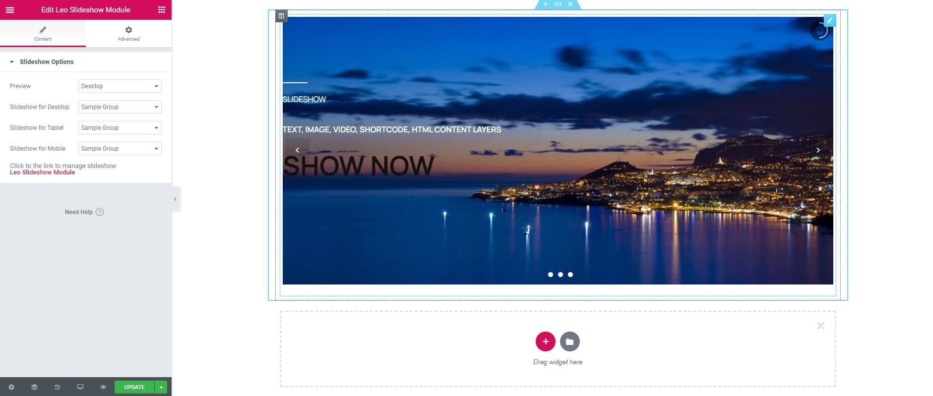
Content Tab
Slideshow Options
- Preview: Select screen to preview.
- Slideshow for Desktop: Select the source of the slideshow for Desktop.
- Slideshow for Tablet: Select the source of the slideshow for Tablet.
- Slideshow for Mobile: Select the source of the slideshow for Mobile.
Information
Thank you for reading!
We hope you can create the best website with our module.
Getting Support
If you can't find an answer to your question by searching in this userguide, please go to our forum and post a detailed topic about the issue, along with your website URL, or send it to us via email.
- Forum
- Ticket
- Contact us
- Email: leotheme@gmail.com
- Skype Support: trandinhnghiait
- YouTube
The Scope Of Our Support
Our support covers configuration, building site as demo, trouble while using any features, bug fixes. We don't provide support for customizations or 3rd party extension.
Our Support Time
We always try our best to help you with the problem as soon as possible, ut sometime it will take a little longer due to different time zones
Our working hours are 8.00 AM - 5.30 PM, Monday to Friday (GMT+7). Because of that all the requests for support on the weekend will be replied on the next week. Thank you for your patience.
Leo Theme